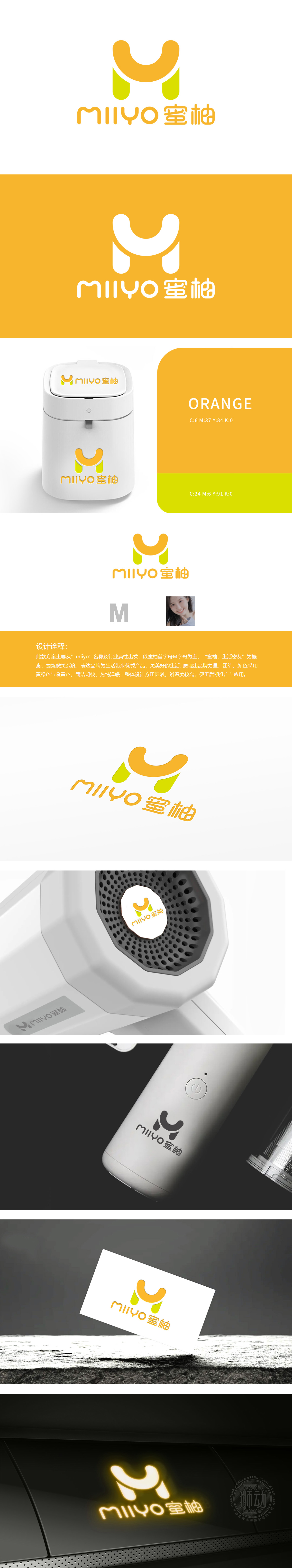
狮动设将品牌名称“MIYO室柚”首字母“M”为视觉主体,结合“蜜柚,生活密友”的概念,通过微笑弧度的线条设计(橙色M字顶部圆润上扬)传递温暖、友好的品牌性格,符合小家电贴近日常、便捷亲切的产品属性。暖黄色传递热情、温暖,符合“生活密友”的亲近感;符合小家电品牌“易用、直观”的产品特性,在美学设计中兼顾“辨识度”“推广适配性”等商业需求,体现设计不仅是视觉呈现,更是品牌战略的可视化载体,尤其契合小家电品牌温暖、实用、年轻化”的核心价值。
Lion Design takes the initial letter "M" of the brand name "MIYO Room Pomelo" as the visual subject, and combines the concept of "honey pomelo, a close friend of life" to convey a warm and friendly brand character through the curved line design (the top of the orange M word rises roundly), which conforms to the product attributes of small household appliances that are close to daily life, convenient and cordial. Warm yellow conveys enthusiasm and warmth, which is in line with the closeness of "life close friends"; It is in line with the product characteristics of small household appliance brands that are easy to use and intuitive.


扫码或拨打添加客服微信


