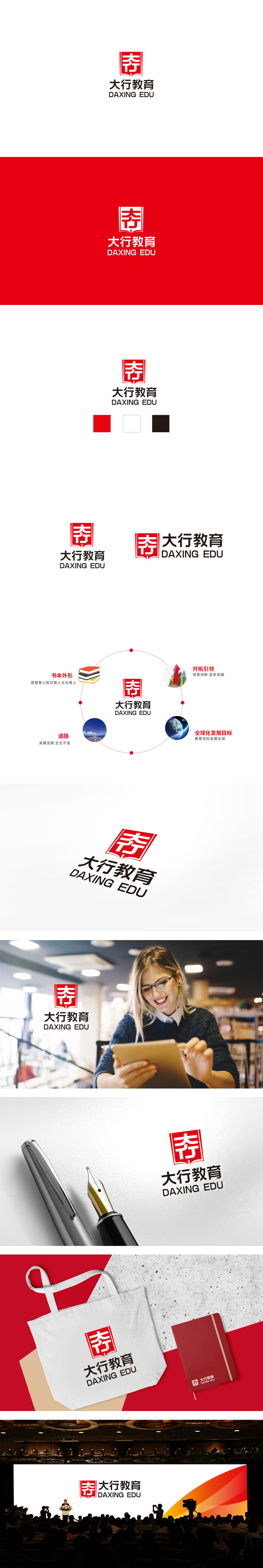
狮动设计用展开的书本+组合汉字”**的叠加设计,书本符号:直接关联教育行业的核心属性——“知识传播”。展开的书页形态象征“开放”)、“传播”,甚至“成长”,是教育品牌最易被识别的视觉符号。字的“稳定结构”:“大”字的舒展与“行”字的紧凑形成平衡,象征“大格局”(教育的视野)与“行动力”(教育的执行)的结合,传递“既有远大目标,又注重脚踏实地”的教育理念。红与黑的对比:红色的“热情”对应“对教育的热爱”,黑色的“专业”对应“对教育的严谨”,二者结合传递“用热情做教育,用专业办教育”的品牌承诺。整体设计简洁与力量感兼顾,符合品牌调性。
Lion design uses the superposition design of unfolded books and combined Chinese characters. Book symbol is directly related to the core attribute of education industry-"knowledge dissemination". The unfolded page form symbolizes "opening", "spreading" and even "growth", which is the most easily recognized visual symbol of educational brand.The "stable structure" of Chinese characters: the extension of the word "big" and the compactness of the word "line" form a balance, which symbolizes the combination of "big pattern" .


扫码或拨打添加客服微信


