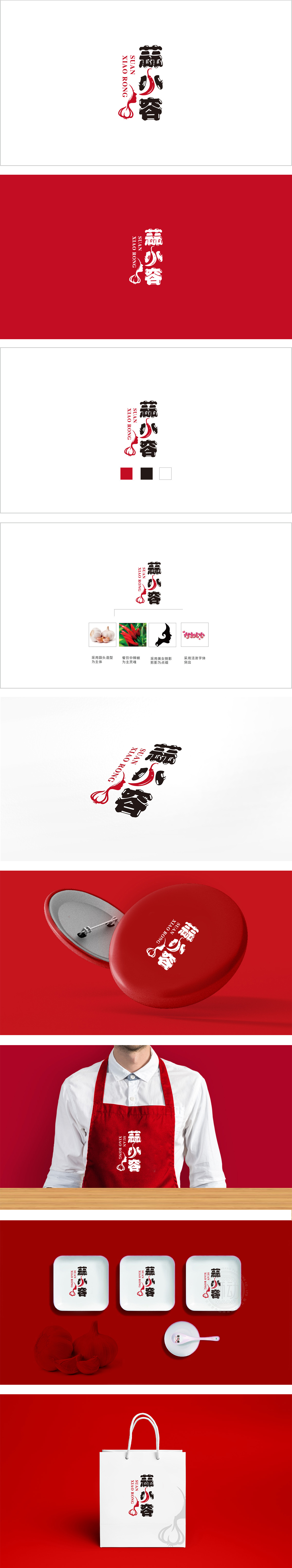
狮动设计用大蒜鳞茎的轮廓+女性侧脸的剪影,巧妙融合成一个「带蒜香的姑娘」形象。这种设计不仅直接点出了品牌核心食材(蒜),更把「蒜」变成了有温度的「小容」——像身边亲切的朋友,瞬间拉近了与消费者的距离(尤其符合生鲜品牌「家常、鲜活、有烟火气」的定位)。「用颜色与布局讲「新鲜感」红+黑的经典对比,既保留了生鲜的「活力感」(红色像新鲜食材的光泽,传递「鲜活、热情」),又用黑色奠定了「可靠感」,把“蒜”的灵魂,揉进了家常的温度里。
Lion designed to skillfully blend the outline of garlic bulbs with the silhouette of women's side faces into a "girl with garlic fragrance" image. This design not only directly points out the core ingredient of the brand (garlic), but also turns garlic into a "small container" with temperature-like a friendly friend around, which instantly narrows the distance with consumers (especially in line with the positioning of fresh brands as "homely, lively and smoky"). The classic contrast of "freshness" with color and layout "red+black" not only retains the fresh.


扫码或拨打添加客服微信


