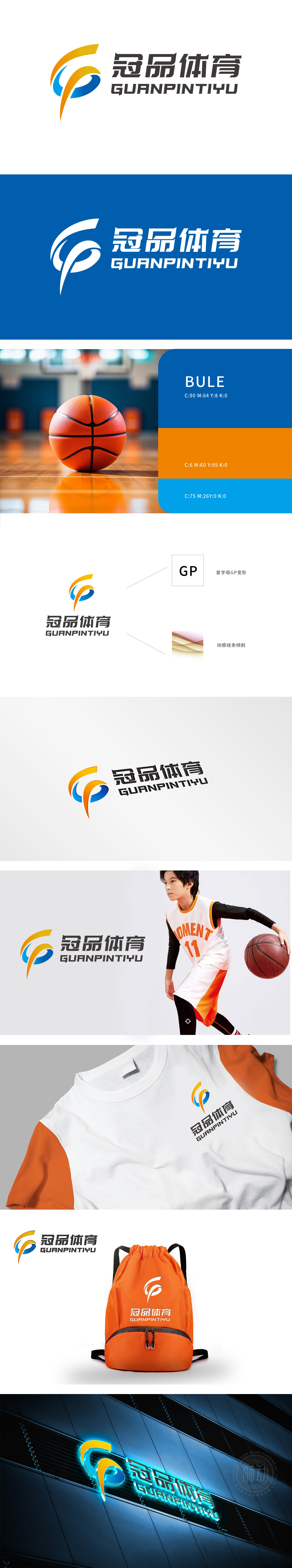
冠品体育LOGO设计项目中,狮动深度挖掘客户“活力、协作、创新”的品牌核心。以三条流畅曲线构筑动态视觉,橙黄蓝交织传递多元体育精神,黑色字体强化专业质感。设计精准平衡活力与稳重,拼音元素提升辨识度。交付成果高度契合冠品体育的品牌调性,获客户高度认可,成为体育行业标志设计典范。
In the LOGO design project of Guanpin Sports, Lion Sports deeply explores the brand core of "vitality, cooperation and innovation" of customers. Dynamic vision is built with three smooth curves, orange, yellow and blue interweave to convey multi-sports spirit, and black font strengthens professional texture. The design accurately balances vitality and stability, and pinyin elements enhance recognition. The delivered results are highly consistent with the brand tonality of Guanpin Sports, highly recognized by customers and become a model of logo design in sports industry.


扫码或拨打添加客服微信


