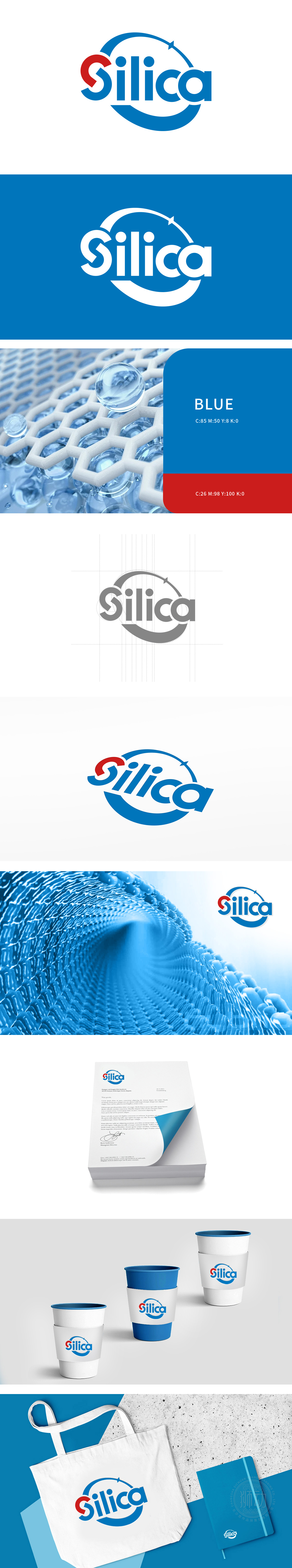
狮动设计采用几何切割感黑体,字母线条如化工管材般硬朗,却在细节处暗藏巧思:“i”的圆点设计为实心蓝点,如同反应釜中的关键分子;“c”的开口弧度与环形弧线呼应,形成“分子吸附-反应-释放”的动态联想,让静态字体传递出化工反应的流动性。外围蓝色半弧线如同化工生产中的循环反应路径,用视觉呈现化工流程“输入-转化-输出”的高效闭环。红色“S”=催化剂般的破局力量:在工业蓝的理性基调中,红色首字母“S”如同一剂强效催化剂,以高饱和色打破传统化工标识的沉闷感,既象征品牌在化纤材料领域的技术突破(如新型催化剂、改性纤维),也隐喻“统合”过程中打破壁垒、激活效能的核心价值。
Lion's design adopts geometric cutting bold, and the letter lines are as tough as chemical pipes, but there are clever ideas hidden in the details: the dot of "I" is designed as a solid blue dot, just like the key molecule in the reaction kettle; The opening radian of "C" echoes the circular arc, forming a dynamic association of "molecular adsorption-reaction-release", which makes the static font convey the fluidity of chemical reaction. The peripheral blue semi-arc is like a circular reaction path in chemical production, which visually presents an efficient closed loop of "input-transformation-output" in chemical process. Red "S" = catalyst-like breaking power: In the rational tone of Industrial Blue, the red initials "S" are like a powerful catalyst.


扫码或拨打添加客服微信


