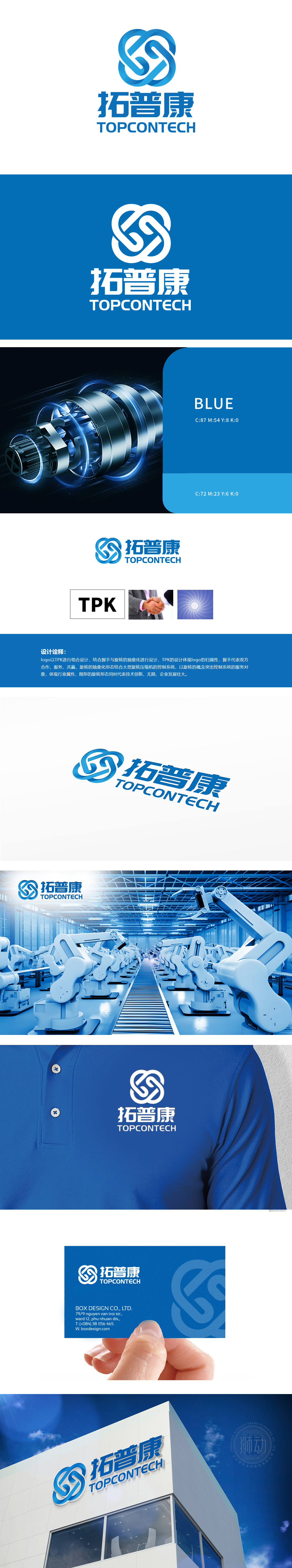
狮动设计将“TPK”字母、握手(合作)、旋转(行业特性)三大元素通过流畅线条融合,既保证品牌辨识度,又赋予多重寓意,体现设计的层次感。行业属性与品牌理念的统一:通过“旋转”形态呼应重工机械相关的控制系统业务,同时以“握手”传递服务导向,避免了纯工业设计的冰冷感,兼顾专业性与亲和力。LOGO整体简洁易记,蓝色主色调沉稳且适合工业场景,展现了较强的逻辑关联性和视觉表现力。
Lion Design combines the three elements of "TPK" letter, handshake (cooperation) and rotation (industry characteristics) through smooth lines, which not only ensures brand recognition, but also gives multiple meanings, reflecting the layering of design. The unification of industry attribute and brand concept: it echoes the control system business related to heavy machinery through "rotation" form, and at the same time conveys service orientation through "handshake", which avoids the cold feeling of pure industrial design and gives consideration to professionalism and affinity.


扫码或拨打添加客服微信


