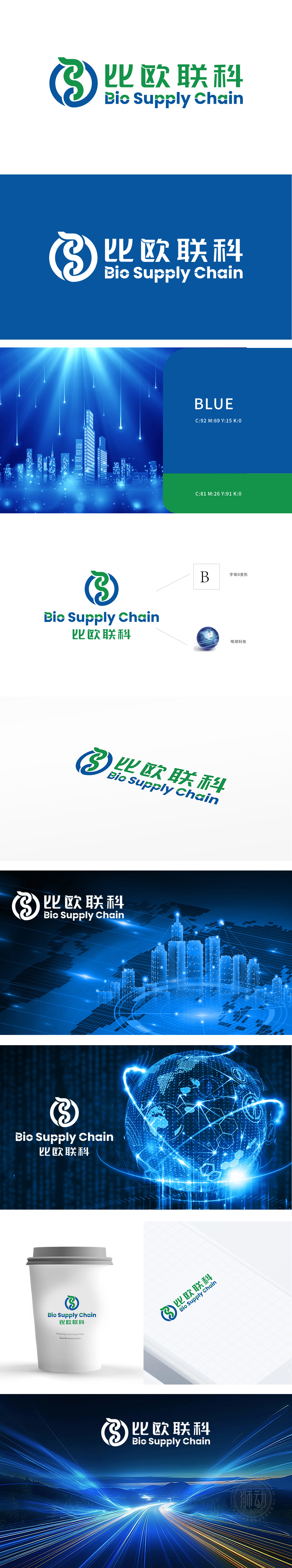
狮动设计采用字母“B”的抽象变形(对应“Bio”首字母),线条流畅且富有动感,兼具生物/自然属性的柔和感。蓝色外圈与绿色内圈相互缠绕,形成“无限符号”的视觉联想,寓意供应链的全球化、可持续性,也体现品牌的包容性与联动性。通过色彩、字体、辅助图形的组合,精准塑造了“科技、专业、全球化、可持续”的品牌形象。从抽象字母到全球化符号,每一笔线条都暗藏行业逻辑与未来感,让“生物供应链”的科技属性跃然眼前。
Lion design adopts the abstract deformation of the letter "B" (corresponding to the initial letter of "Bio"), with smooth and dynamic lines and a soft sense of biological/natural attributes. The blue outer ring and the green inner ring are intertwined to form a visual association of "infinite symbols", which symbolizes the globalization and sustainability of the supply chain and also reflects the inclusiveness and linkage of the brand. Through the combination of colors, fonts and auxiliary graphics, the brand image of "technology, professionalism, globalization and sustainability" has been accurately shaped. From abstract letters to global symbols, every line hides industry logic .


扫码或拨打添加客服微信


