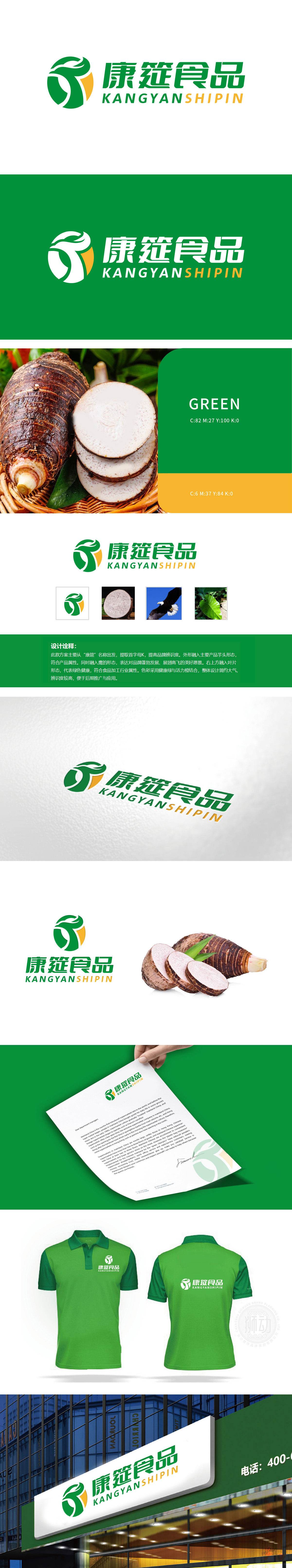
狮动设计从“康筵”名称出发,提取首字母K,提高品牌辨识度。外形融入主要产品芋头的形态,符合产品属性。突出食品的天然和健康属性。同时,设计中融入了鹰的形态,表达对品牌蓬勃发展的美好愿景。鹰象征着力量、自由和高远的视野,此处使用鹰的形象,寓意品牌如鹰一般展翅高飞,不断进取。通过简洁有力的视觉语言传达了康筵食品绿色、健康、蓬勃发展的品牌理念。鹰翅凌空展翅,象征品牌突破桎梏、翱翔市场;芋头与绿叶的自然元素,则传递出对食材本真与生态环保的坚守。
Lion design starts from the name of "Kangyan" and extracts the initials K to improve brand recognition. The shape is integrated into the shape of the main product taro, which conforms to the product attributes. Highlight the natural and health attributes of food. At the same time, the eagle shape is integrated into the design to express the beautiful vision of the brand's vigorous development. The eagle symbolizes strength, freedom and lofty vision. The image of the eagle is used here, which means that the brand flies like an eagle and keeps making progress.


扫码或拨打添加客服微信


