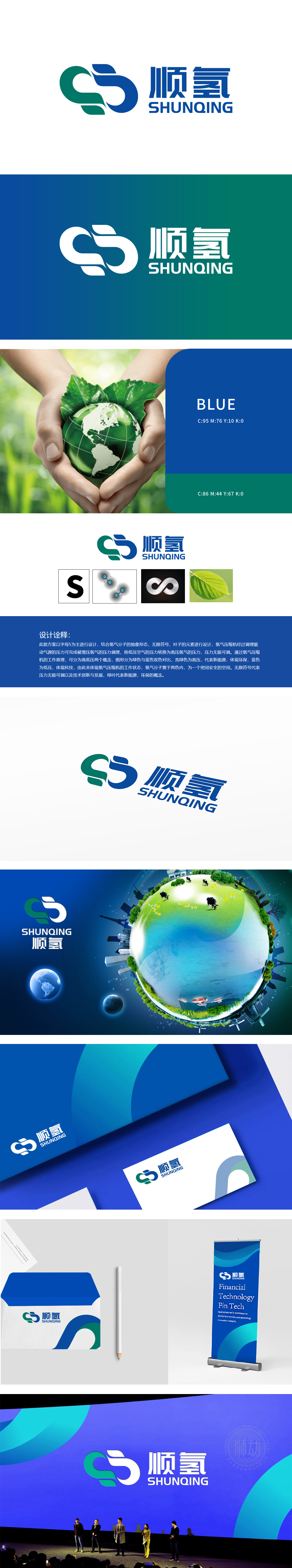
狮动设计采用以字母“S”(顺氢拼音首字母)为视觉核心,同时通过曲线形态模拟氢气“流动、转换”的物理特性(从低压到高压的压缩过程),将抽象的技术原理转化为具象的视觉语言。这种设计既强化品牌识别度,又巧妙呼应“氢能高效转化”的环保价值“,紧扣“氢能”与“环保”两大核心,通过绿叶、无限符号等符号构建清晰的视觉联想,避免环保元素的泛化或堆砌,实现“环保理念不空洞,技术特性不抽象”。
Lion design takes the letter "S" (the initial letter of cis-hydrogen pinyin) as the visual core, and simulates the physical characteristics of hydrogen "flow and transformation" (compression process from low pressure to high pressure) through curve shape, transforming abstract technical principles into concrete visual language. This design not only strengthens brand recognition, but also ingeniously echoes the environmental protection value of "efficient conversion of hydrogen energy"


扫码或拨打添加客服微信


