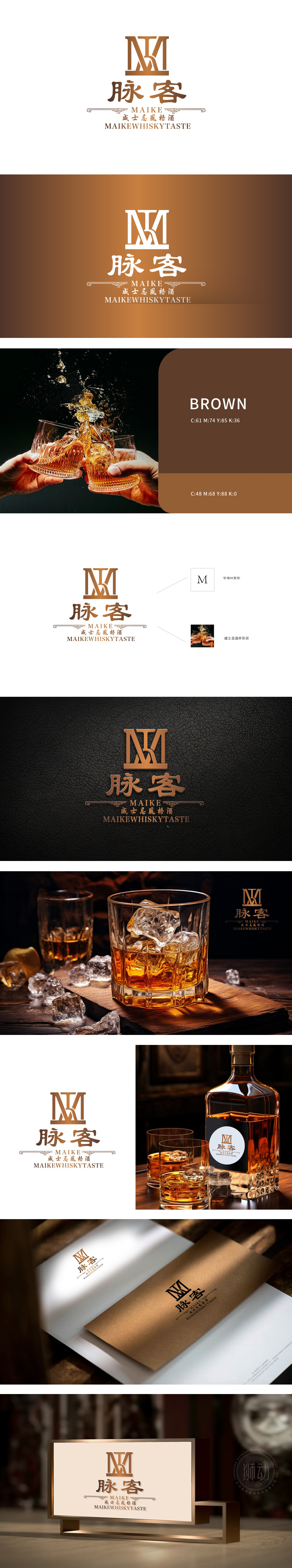
狮动设计通过大写字母“M”的艺术化变形,采用金色渐变质感,线条硬朗且富有层次,通过双竖线与交叉结构强化立体感,既保留了字母“M”的识别性,又赋予其高端、稳重的视觉印象,呼应品牌名称“脉客”的首字母,金色作为主色调,传递出威士忌品类常有的奢华、经典与醇厚感,符合酒类产品的高端定位,金色渐变如陈年酒液般醇厚,双“M”交叠的轮廓暗合威士忌酒杯的优雅弧度,当书法笔触的“脉客”二字落下,传统韵味与现代烈酒的张力瞬间炸裂,让每一次目光停留,都像开启一瓶等待已久的佳酿。
Lion design adopts the artistic deformation of the capital letter "M", adopts the golden gradient texture, and the lines are tough and rich in layers. The three-dimensional sense is enhanced by double vertical lines and cross structures, which not only retains the recognition of the letter "M", but also gives it a high-end and steady visual impression, echoing the initials of the brand name "Maike", with gold as the main color, conveying the usual luxury, classic and mellow feeling of whisky products, which is in line with the wine products. The gradient of gold is as mellow as aged wine, and the overlapping outline of double "M" coincides with the elegant radian of whisky glass.


扫码或拨打添加客服微信


