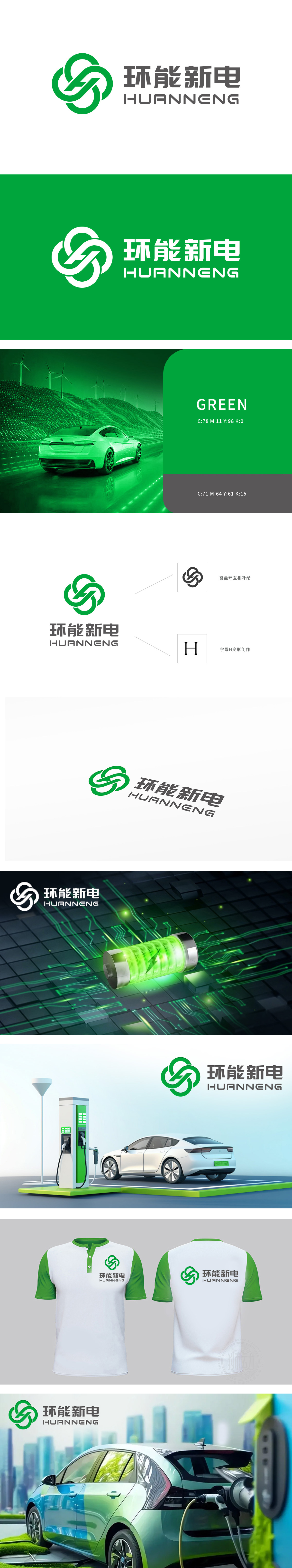
狮动设计由两个相互交织的环形构成闭环结构,内部嵌入变形的“E”字母,整体形成类似“∞”(无限符号)的视觉联想,既体现“环能”的品牌名称,又隐喻能源的循环利用与可持续性。环形线条流畅且富有动感,打破静态平衡,暗示新能源的动力与科技活力;双环“互相补给”的设计象征电池充放电循环、能源互联等技术理念,强化“能量闭环”的品牌主张。整体采用简约几何+绿色主调的设计语言,直观契合新能源行业“环保、科技、可持续”的核心价值。
Lion design consists of two intertwined rings, which form a closed-loop structure, and the deformed letter "E" is embedded in it, forming a visual association similar to "∞" (infinite symbol), which not only embodies the brand name of "environmental energy", but also symbolizes the recycling and sustainability of energy. The circular lines are smooth and dynamic, which breaks the static balance and implies the power and technological vitality of new energy; The design of double-ring "mutual replenishment" symbolizes the technical concepts such as battery charging and discharging cycle and energy interconnection, and strengthens the brand proposition of "energy closed loop".


扫码或拨打添加客服微信


