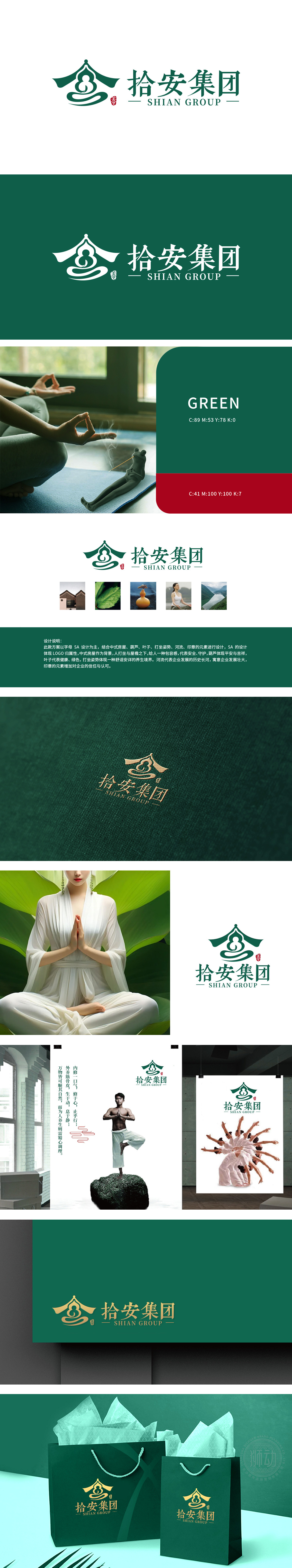
狮动受拾安集团委托设计品牌logo,以“稳健、专业、信赖”为核心理念深度提炼。图形标志采用抽象建筑形态,象征集团行业根基与包容性;顶部圆形元素寓意安全与圆满,绿色主色调传递生态与可靠感。整体设计将品牌战略视觉化,兼顾辨识度与美感,精准传递企业价值观,最终方案获客户高度认可,有效提升品牌影响力。
Lion Motion is entrusted by Shi 'an Group to design the brand logo, and it is deeply refined with the core concept of "stability, professionalism and trust". Graphical signs adopt abstract architectural forms, symbolizing the foundation and inclusiveness of the group industry; The circular element at the top symbolizes safety and perfection, and the green main color conveys the sense of ecology and reliability. The overall design will visualize the brand strategy, give consideration to the recognition and aesthetic feeling, and accurately convey the corporate values. The final plan will be highly recognized by customers and effectively enhance the brand influence.


扫码或拨打添加客服微信


