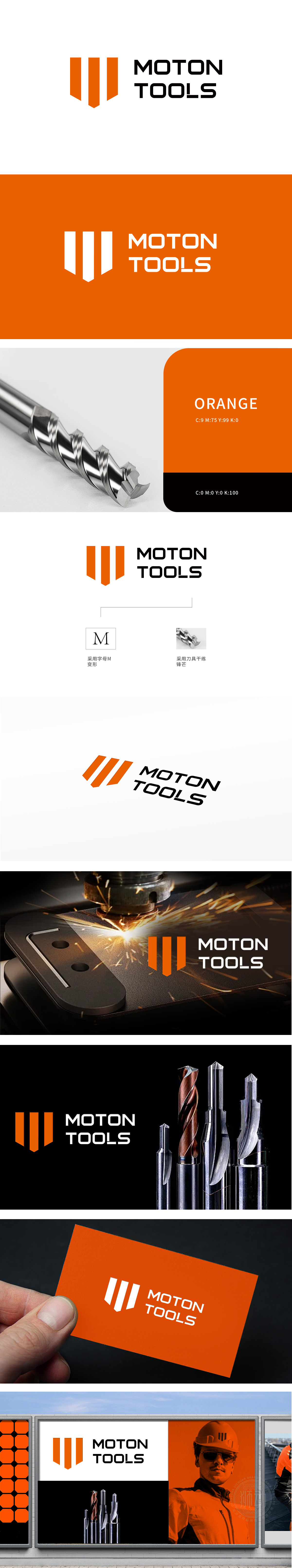
狮动设计采用字母“M”的变形,强化品牌首字母记忆点,橙色的活力与刀具的金属质感相呼应,视觉上仿佛能感受到刀具的锐利,从设计层面就巧妙关联了品牌所属的刀具五金机械领域。企业名称”采用黑色粗体字,简洁醒目,易于识别,传递出品牌的硬朗特质,契合五金机械、刀具行业给人的坚固耐用印象。将抽象科技与具象行业元素无缝衔接,用色彩与符号构建差异化视觉体系。
Lion design strengthens the brand's initial memory with the deformation of the letter "M". The vitality of orange echoes the metal texture of the tool, which seems to feel the sharpness of the tool visually, and is skillfully related to the tool hardware and machinery field to which the brand belongs from the design level. written in bold black, which is simple and eye-catching and easy to identify. Seamless connection between abstract technology and concrete industry elements


扫码或拨打添加客服微信


