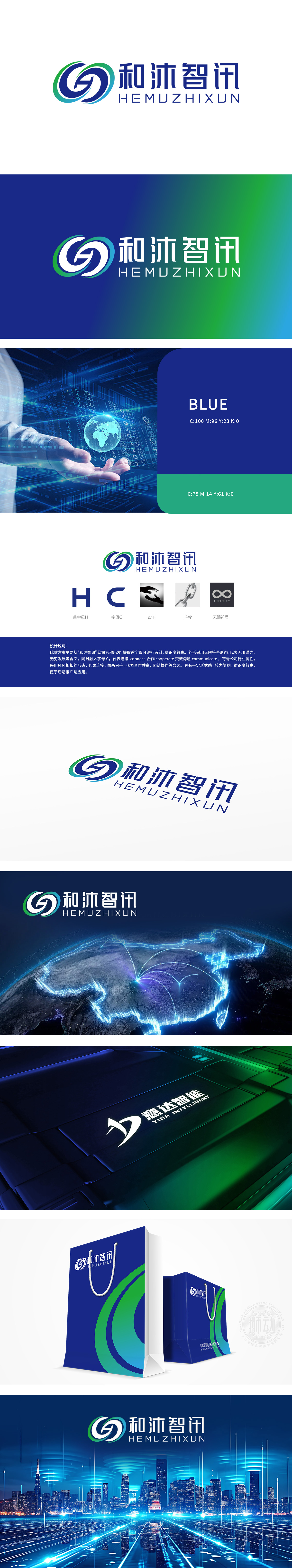
狮动设计提取公司名称首字母H,辨识度高,外形用无限符号,寓意无限潜力、无穷发展。融入字母C,代表连接(connect)、合作(cooperate)、交流沟通(communicate),契合通信行业属性。环环相扣的形态如两只手,象征合作共赢、团结协作。整体形式感强,简约且辨识度高,利于后期推广应用。
Lion Motion Design extracts the initials H of the company name, which is highly recognizable, and its shape uses infinite symbols, implying infinite potential and development. Incorporating the letter C stands for connect, cooperate and communicate, which is in line with the attributes of the communication industry. The interlocking form is like two hands, symbolizing win-win cooperation.


扫码或拨打添加客服微信


