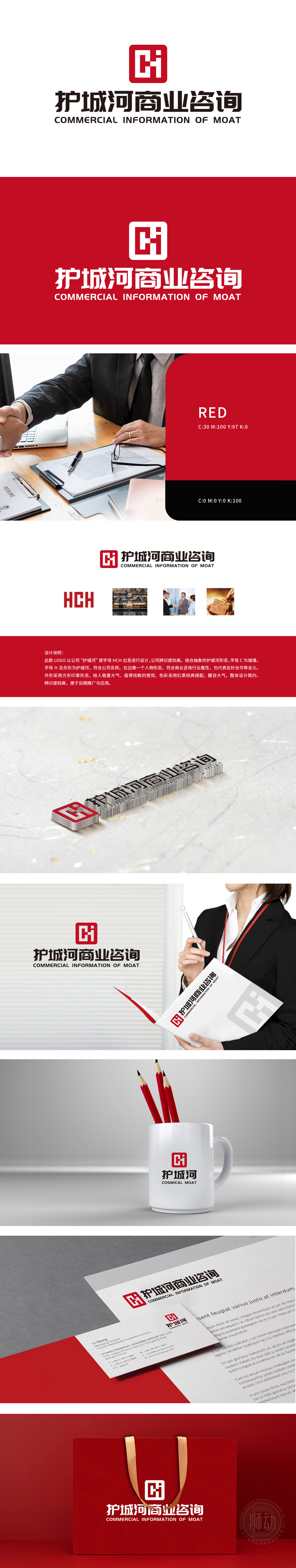
狮动设计以公司“护城河”首字母HCH设计,结合抽象护城河形态(字母C为城墙,H及负形为护城河),方形印章形态,传递稳重大气、值得信赖感,符合商业咨询追求可靠、专业的行业印象塑造。红黑经典搭配,醒目且具冲击力,易吸引目光,同时红色常与活力、热情相关,黑色代表专业、稳重,二者结合平衡且强化品牌印象,便于记忆与识别。整体设计传达的稳重大气、值得信赖感,利于在商业咨询客户心中建立专业、可靠的品牌形象。
Lion design is based on the company's "moat" initials HCH design, combined with the abstract moat shape (letter C for the city wall, H and negative for the moat) and the square seal shape, which conveys a stable atmosphere and is trustworthy, in line with the pursuit of reliable and professional business impression.The classic combination of red and black is eye-catching and impactful, which is easy to attract attention. At the same time, red is often related to vitality and enthusiasm, while black represents professionalism and stability. The combination of the two is balanced and strengthens the brand impression
.


扫码或拨打添加客服微信


