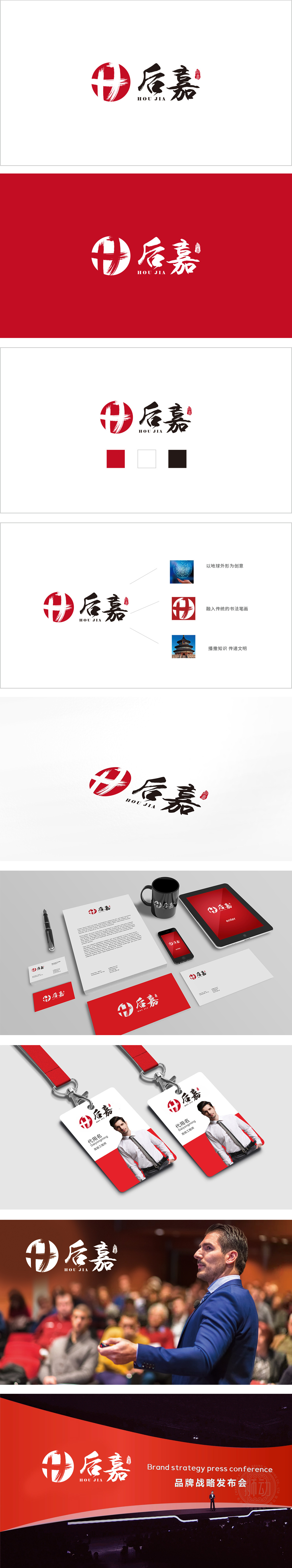
狮动设计采用中国风为基底,搭配后嘉”书法字:毛笔字的“苍劲感”传递稳重与可靠,形成“传统+现代”的融合风格——这种组合恰好对应教育行业的核心矛盾:既要传承文化根脉,又要拥抱时代需求。红色对应教育的“热情”,圆形对应“包容”,“十”字对应“进步”,书法字对应“稳重”,印章对应“权威”——所有元素都紧扣教育行业的成长的核心需求,同时通过“传统与现代的融合”形成了独特的品牌辨识度。
Lion design is based on Chinese style, matched with the calligraphy character "Houjia": the "vigor" of the calligraphy character conveys steadiness and reliability, and forms the fusion style of "tradition+modernity"-this combination just corresponds to the core contradiction of the education industry: it is necessary to inherit the cultural roots and embrace the needs of the times. Red corresponds to the enthusiasm of education.


扫码或拨打添加客服微信


