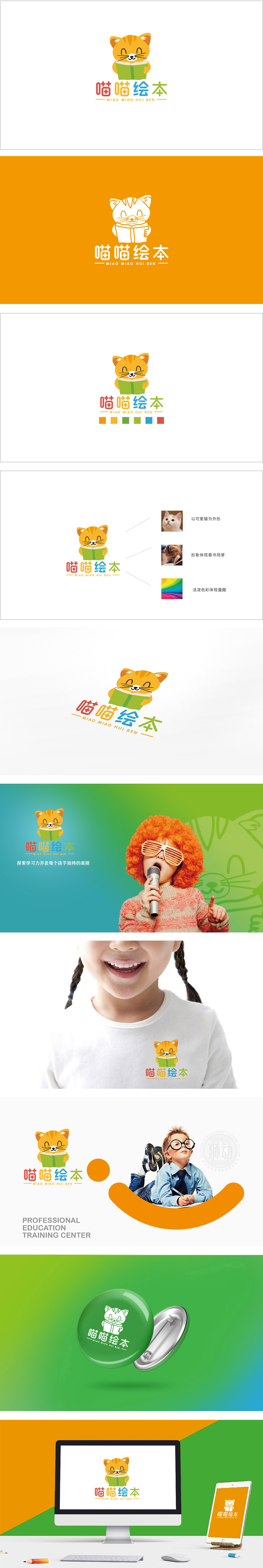
狮动设计采用猫”+“书”**两个强符号组成,直接对应“喵喵绘本”的核心定位——以“猫”为IP载体的儿童绘本品牌。卡通猫的造型:精准传递“友好、治愈”的情绪,像小朋友身边的伙伴。书的造型,强化“阅读”的核心动作。整体风格采用扁平化+极简主义,每一个元素都为“儿童绘本”的核心定位服务:猫=IP载体=儿童的“伙伴感”;书=核心产品=阅读的“仪式感”;色彩=情绪传递=儿童的“视觉习惯”;造型=极简识别=品牌的“传播效率”,用“情绪价值”连接用户。
Lion design is composed of two strong symbols: cat+book * *, which directly corresponds to the core positioning of "meow picture book"-a children's picture book brand with "cat" as the IP carrier. Cartoon cat's modeling: accurately convey "friendly and healing" emotions, like friends around children. The shape of the book strengthens the core action of "reading". The overall style adopts flattening+minimalism, and each element serves as the core positioning service of "children's picture book": cat =IP carrier = children's "sense of partnership".


扫码或拨打添加客服微信


