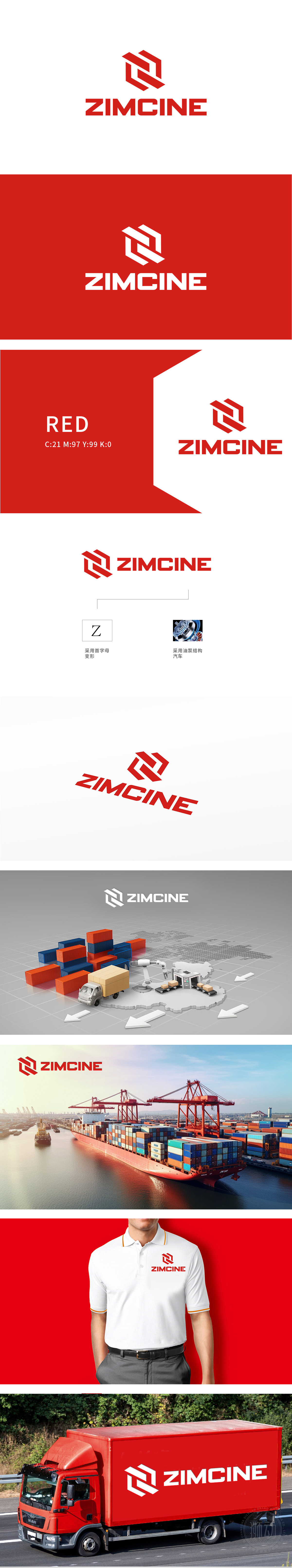
狮动设计以品牌首字母“Z”与油泵结构,如工业机械精密部件的完美咬合般融合。既鲜明亮出品牌之名,又隐秘却有力地暗示产品属性。此等融合,尽显设计的精妙巧思与大胆创想,色彩以醒目的红色为主色调,能让品牌迅速被精准辨识。整体设计传达出专业、现代和创新的品牌形象,符合技术驱动型企业的定位。独特的字母变形和行业特征,为品牌创造了较高的记忆点,有助于在竞争中脱颖而出。
Lion is designed to move. The brand initials "Z" are integrated with the oil pump structure, such as the perfect occlusion of precision parts of industrial machinery. It not only clearly shows the name of the brand, but also implicitly but powerfully implies the product attributes. Such integration shows the exquisite ingenuity and bold creativity of the design, and the color is dominated by eye-catching red, which can make the brand quickly and accurately recognized. The overall design conveys a professional, modern and innovative brand image and conforms to the positioning .


扫码或拨打添加客服微信


