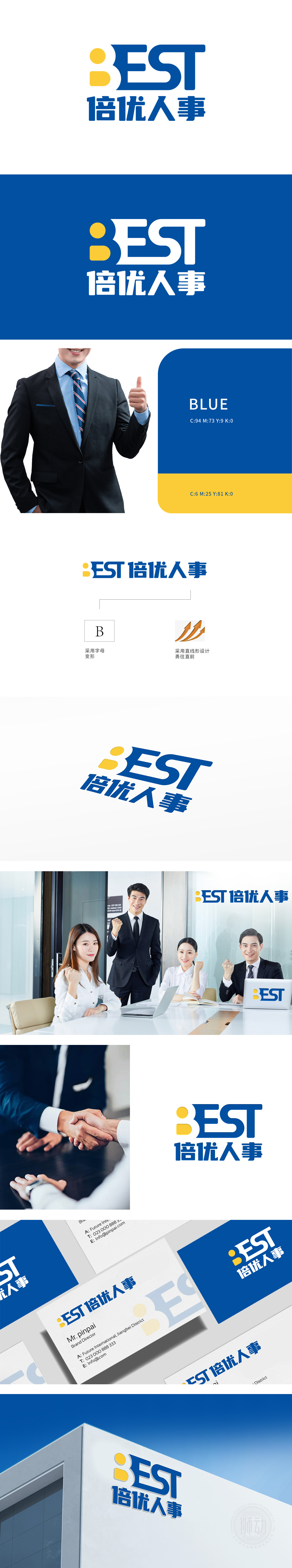
狮动设计采用字母B” 变形设计“,此设计强化了品牌的独特识别性,辨识度高,色彩采用了蓝黄配色,其中蓝色通常给人专业、可靠的感觉,符合人力资源服务行业给人以信任的需求,而黄色的点缀增加了视觉亮点和活力。寓意着人才在合适的人力规划下能勇往直前地实现职业发展。从人力资源专业角度解读,它体现了该公司积极推动人才与企业共同进步的服务宗旨与能力信心,整体设计将专业属性和积极向上的理念相结合,将公司在人力资源领域内提供优质服务的独特标识与美好象征具象化。
Lion design uses the letter B "Variant Design", which is the initial letter of "Beyonder". This design strengthens the brand's unique recognition and has a high degree of recognition. The color is blue and yellow, in which blue usually gives people a professional and reliable feeling, which meets the trust needs of the human resources service industry, while yellow embellishment increases the visual highlights and vitality. It means that talents can bravely realize their career development under the appropriate manpower planning. From the perspective of human resources specialty, it reflects the company's service aim and ability confidence to actively promote the common progress of talents and enterprises.


扫码或拨打添加客服微信


