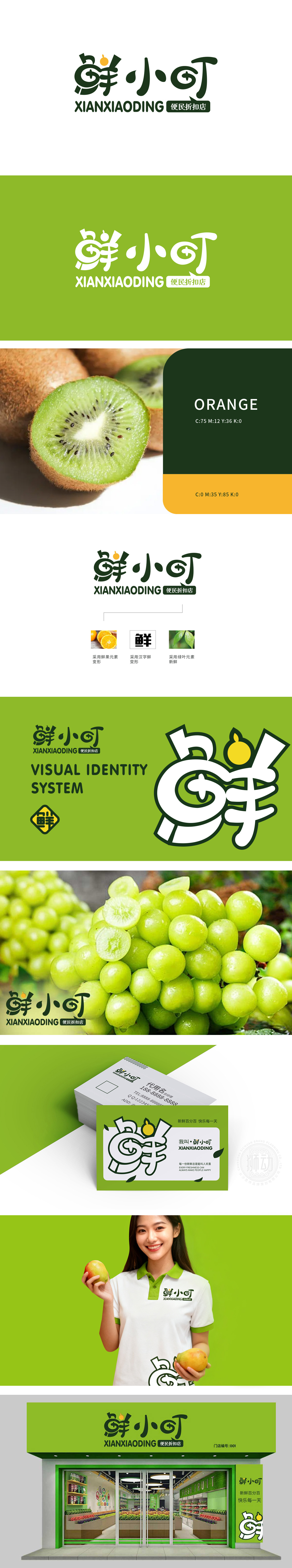
狮动设计将“鲜小叮”几个字采用了活泼且富有亲和力的风格,其中“鲜”字尤为突出。它巧妙地融合了鲜果元素的变形,让人一眼就能联想到新鲜的水果,瞬间传递出“生鲜”的核心概念。搭配的绿叶元素,进一步强化了“新鲜”的感觉,绿叶的生机与活力,为整个标志增添了自然、健康的氛围。清新感扑面而来,瞬间抓住眼球。每一处设计细节都在诉说着“新鲜”二字,让人一看就知道这是个主打生鲜、便民实惠的好地方。
Lion design adopts a lively and friendly style with the word "fresh and small ding", among which the word "fresh" is particularly prominent. It skillfully combines the deformation of fresh fruit elements, which makes people think of fresh fruit at a glance and instantly conveys the core concept of "freshness". The collocation of green leaf elements further strengthens the feeling of "freshness", and the vitality and vigor of green leaves add a natural and healthy atmosphere to the whole logo. A sense of freshness came to my face and caught my eye in an instant. Every design detail is telling the word "fresh", which makes people know at a glance that this is a good place that focuses on fresh food and is convenient and affordable.


扫码或拨打添加客服微信


