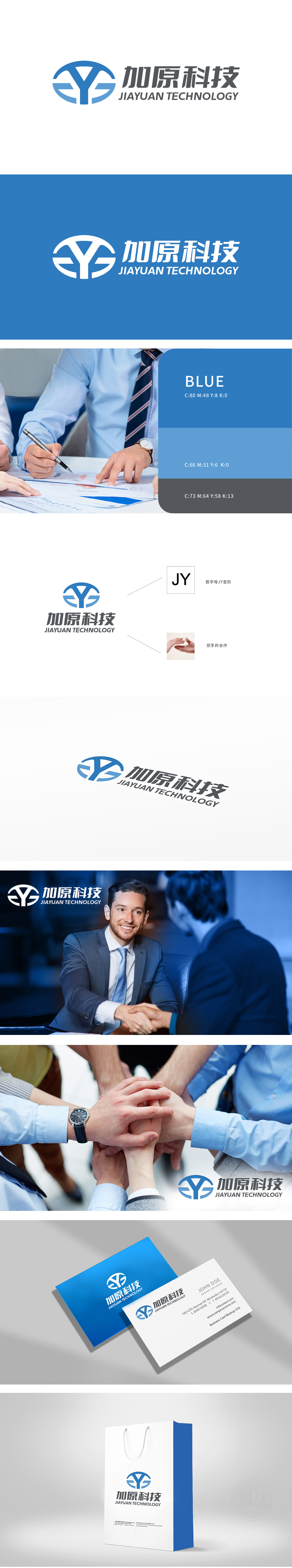
狮动设计采用简洁有力的“JY”变形,以极简却极具记忆点的方式塑造品牌认知;“双手的合作”意象更是神来之笔,将企业的合作理念具象化、情感化。蓝色主调赋予其专业、沉稳且不失活力的气质。整体设计既具视觉冲击力又蕴含商业哲学,是商业咨询中品牌形象设计可借鉴的典范,诠释了如何用图形设计为企业赋能,在市场竞争中脱颖而出并传递深层商业理念。
Lion design uses concise and powerful "JY" deformation to shape brand recognition in a minimalist but memorable way; The image of "cooperation between two hands" is even more ingenious, which makes the cooperation concept of enterprises concrete and emotional. The blue theme gives it a professional, calm and energetic temperament. The overall design has both visual impact and business philosophy, which is a model for brand image design in business consulting, and explains how to empower enterprises with graphic design.


扫码或拨打添加客服微信


