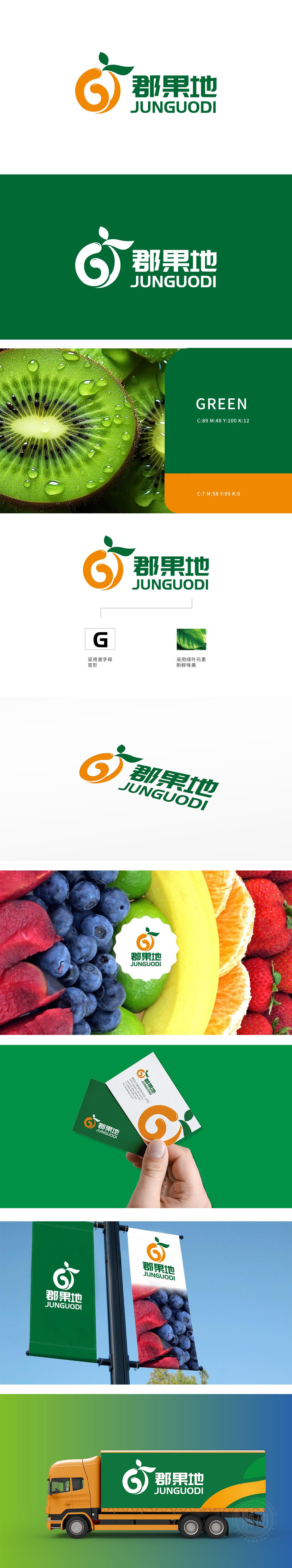
狮动设计采用首字母“G”进行变形设计,,橙色的运用不仅使图形更加醒目,还传递出水果的新鲜、活力与健康的感觉。右上角的绿叶元素为整个设计增添了自然、清新的气息。暗示了水果的新鲜和天然。它传达出“郡果地”所提供的水果是来自自然、无污染的,强调了产品的高品质和健康属性。整体设计将首字母变形与水果图形以及绿叶元素相结合,成功地塑造了一个具有鲜明水果品牌特色的形象。它简洁明了,易于识别,能够在众多品牌中脱颖而出。风格现代、清新,符合当下消费者对于健康、自然食品的追求。
Lion design uses the initial letter "G" for deformation design, and the use of orange not only makes the graphics more eye-catching, but also conveys the feeling of freshness, vitality and health of fruit. The green leaf element in the upper right corner adds a natural and fresh atmosphere to the whole design. Suggests the freshness and naturalness of the fruit. It conveys that the fruits provided by "County Fruit Land" are natural and pollution-free, and emphasizes the high quality and health attributes of the products. The overall design combines the initial deformation with fruit graphics and green leaf elements, and successfully shapes an image with distinctive fruit brand characteristics.


扫码或拨打添加客服微信


