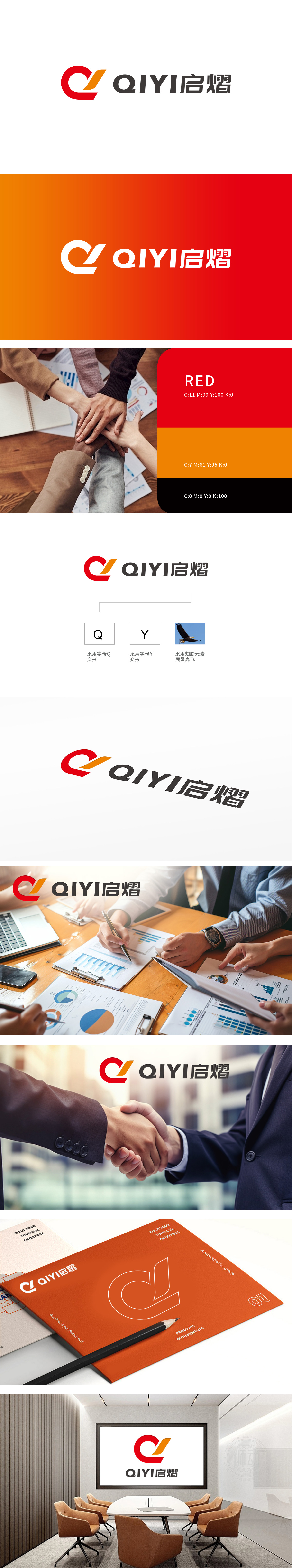
狮动设计以简洁有力的视觉语言,巧妙融合了字母与自然意象。字母变形:左侧字母“Q”经艺术化变形,呈现出流畅且富有动感的红色轮廓,恰似一团跃动的火焰,传递出活力与热情;与之呼应的“Y”,以简练的黑色线条勾勒,与“Q”共同构建品牌首字母的独特标识。同时融入展翅翱翔的雄鹰翅膀元素,以橙黄渐变色彩描绘,赋予标志以升腾之势,象征着品牌追求高远、突破天际的壮志雄心。
Lion design skillfully combines letters and natural images with concise and powerful visual language.Letter deformation: the letter "Q" on the left is artistically deformed, showing a smooth and dynamic red outline, just like a dancing flame, conveying vitality and enthusiasm; The corresponding "Y" is outlined with concise black lines, and together with "Q", it constructs the unique logo of the brand initials. At the same time, it is blended with the elements of the eagle's wings, depicted in orange and yellow gradient colors, giving the logo a rising trend, symbolizing the brand's pursuit of lofty goals and breakthrough in the sky of thank you sir.


扫码或拨打添加客服微信


