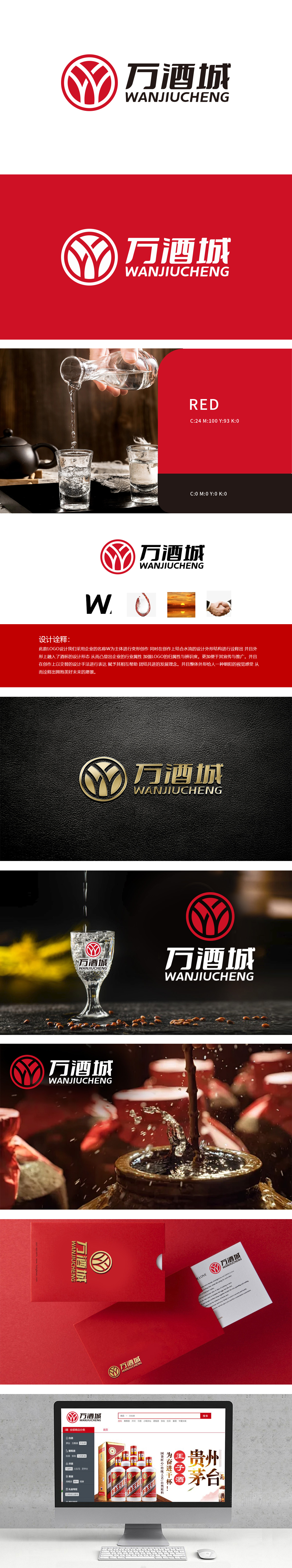
狮动设计为万酒城打造的LOGO,用一滴酒的张撕开传统与现代的边界——赤红环形如窖池陈酿的时光封印,内部交织的"W"以水流之姿破壁而出,时而化作举杯邀月的青瓷盏,时而凝成酒液倾流的弧光,将"酒"的液态灵魂与"城"的包容气度压缩成毫米级的文化密码,用现代语言写给白酒文化的一封"情书"以杯为器、以水为魂、以红为脉,让千年酒文化在方寸之间,迸发直抵人心的视觉冲击力与文化穿透力。
The LOGO designed by Lion Motion for Wanjiu City uses a drop of wine to tear open the boundary between tradition and modernity-a latosolic red ring like a time seal aged in a cellar. The interwoven "W" breaks through the wall in the form of water flow, sometimes turns into a celadon lamp to raise a glass and invite the moon, and sometimes condenses into an arc of pouring wine, which compresses the liquid soul of "wine" and the tolerance of "city" into a millimeter-level cultural code and writes it to liquor in modern language.


扫码或拨打添加客服微信


