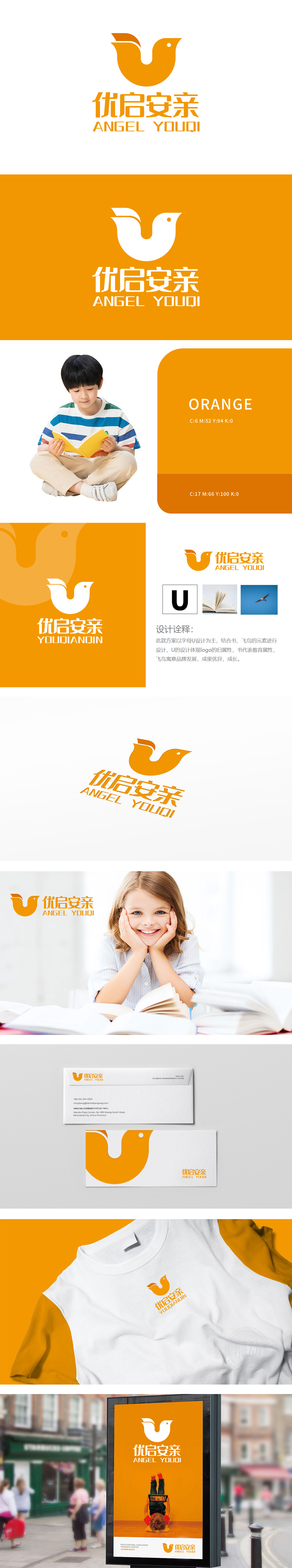
狮动设计以字母 U 为核心支点,如教育巨擘稳稳托起希望。书之元素,似知识的熊熊火炬,照亮教育征程,鲜明彰显教育属性;飞鸟展翅,若梦想的强劲羽翼,寓意品牌在教育天空中,必将迅猛发展、成果卓越、茁壮成长。整个设计不仅赋予logo蓬勃的生命力与发展态势,更从精神层面寓意品牌在教育领域将如飞鸟穿越苍穹般,实现跨越发展,斩获优异成果,完成华丽蜕变与成长。
Lion design takes the letter U as the core fulcrum, such as an educational giant holding up hope steadily. The elements of books, like the blazing torch of knowledge, illuminate the educational journey and clearly show the educational attributes; Birds spread their wings, if the dream is strong, it means that the brand will develop rapidly, achieve outstanding results and thrive in the educational sky. The whole design not only endows logo with vigorous vitality and development trend, but also implies from the spiritual level that the brand will achieve leap-forward development.


扫码或拨打添加客服微信


