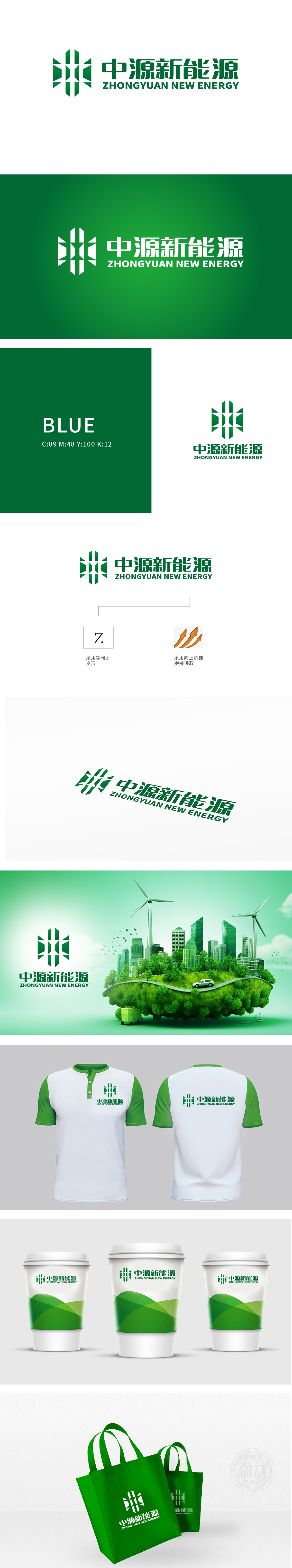
狮动设计采用首字母为“Z“变形设计,向上的阶梯形象,完美诠释了新能源领域不断探索、积极进取的特质。它暗示着中源新能源在技术研发、市场拓展等方面不断攀登高峰,绿色与新能源行业清洁、绿色、环保的核心理念高度契合。整体标志巧妙融合品牌专属字母变形与富有行业寓意和视觉动力的元素,以及潜在的色彩内涵,打造出一个既具独特识别性,又能深度诠释新能源行业特质与品牌愿景的 LOGO。
Lion design, with the initial letter of "Z", is a deformation design, and the upward ladder image perfectly explains the characteristics of continuous exploration and positive progress in the field of new energy. It implies that Zhongyuan New Energy keeps climbing the peak in technology research and development, market expansion and other aspects, and green is highly compatible with the core concepts of cleanliness, green and environmental protection in the new energy industry.


扫码或拨打添加客服微信


