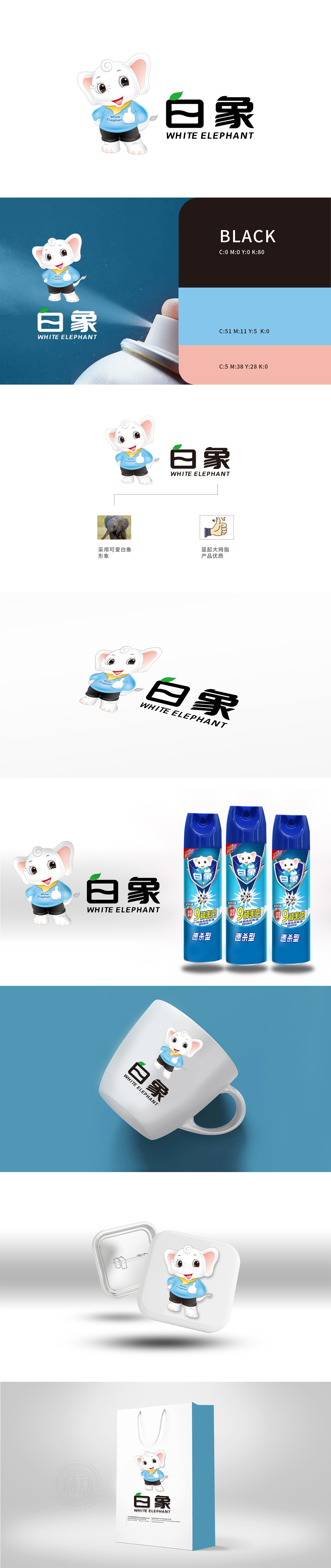
狮动设计以拟人化白象形象为视觉锚点,用“萌系亲和力”消解杀虫剂的冰冷感,同时通过细节符号暗合“高效驱虫”的核心诉求,构建出极具记忆点的品牌识别系统。打破“大象=庞大、缓慢”的固有认知,将其转化为“家庭守护者”——圆滚体型象征“全面防护”,上扬嘴角与竖起的大拇指传递“安心可靠”,而蓝色工装与黄色领巾的搭配,则暗藏“专业、高效”的工业品属性,弱化杀虫剂的“刺激性”联想。白象“站立姿态+守护手势”,暗合“家居环境防护”的使用场景,让消费者直观联想到“它在,害虫退散”的安心感。狮动以反差张力重构日化杀虫剂品牌视觉语言。
Lion design takes the anthropomorphic image of white elephant as the visual anchor, dispels the cold feeling of pesticides with "budding affinity", and at the same time, it builds a brand recognition system with great memory by combining the core demands of "efficient insect repellent" with detailed symbols. Break the inherent cognition of "elephant = huge and slow", and turn it into a "family guardian"-a round figure symbolizes "all-round protection", and the upturned mouth and thumbs up convey "peace of mind and reliability", while the combination of blue tooling and yellow scarf hides the industrial property of "professionalism and efficiency" and weakens the "irritating" association of pesticides. The white elephant's "standing posture+guarding gesture" coincides with the use scene of "home environmental protection".


扫码或拨打添加客服微信


