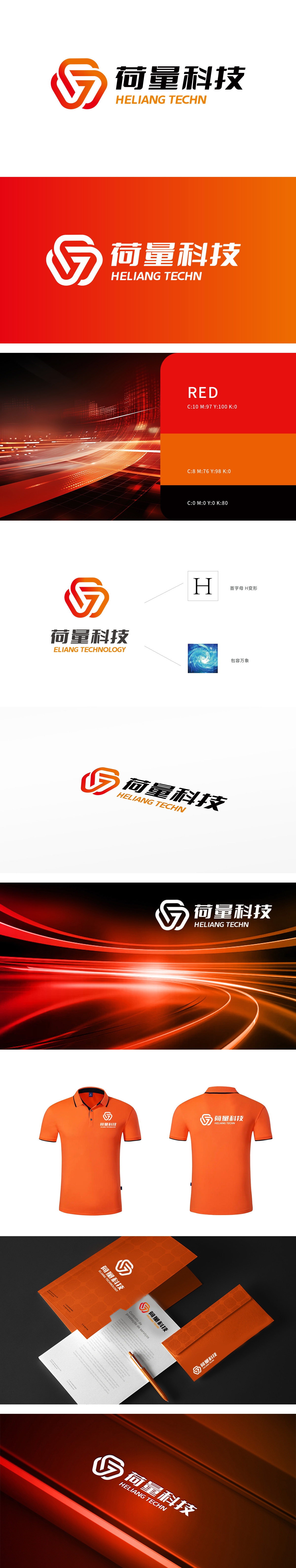
狮动设计基于首字母“H为创意原点,通过抽象化线条重构形成闭环交错的几何图形,红色渐变六边形框架内嵌白色流动线条,既保留“H”的结构骨架,又通过线条的弧度与闭环设计打破静态感,呈现出科技行业的动态创新属性。漩涡的流动感与Logo线条的交错结构相契合,隐喻荷量科技如同“数据漩涡”或“生态中心”,具备汇聚资源、连接多元的互联网核心能力数据整合、生态共建。整体设计既通过“首字母+H”实现品牌专属化,又以“流动线条+包容意象”呼应互联网行业的开放与创新精神,“包容万象”,符合互联网科技公司“跨场景、全链条”的发展趋势。
Lion design takes the initial letter "H" as the creative origin, and forms a closed-loop interlaced geometric figure through abstract line reconstruction. The red gradient hexagonal frame is embedded with white flowing lines, which not only retains the structural skeleton of "H", but also breaks the static sense through the radian of lines and closed-loop design, showing the dynamic innovation attribute of the technology industry. The fluidity of the vortex is consistent with the staggered structure of the Logo lines, which means that Dutch technology, like a "data vortex" or an "ecological center", has the Internet core ability of pooling resources and connecting multiple elements, data integration and ecological co-construction.


扫码或拨打添加客服微信


