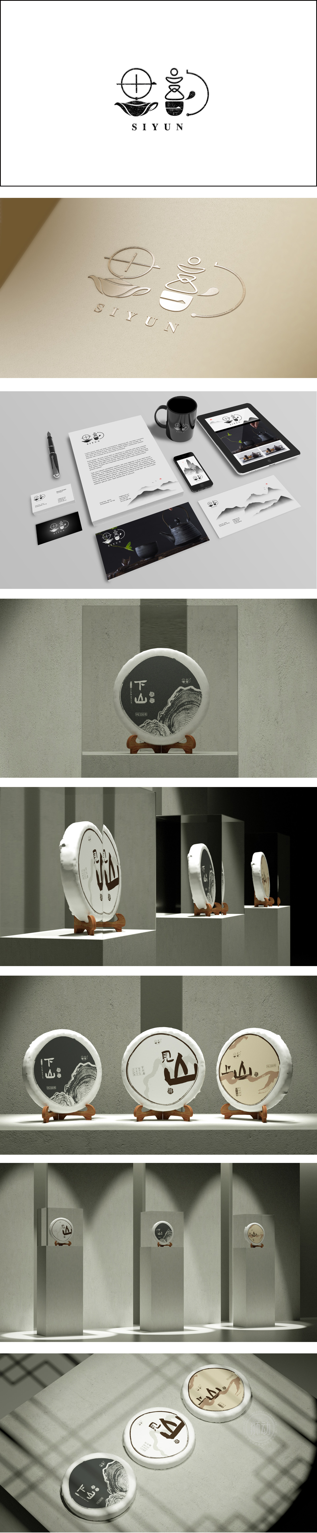
狮动设计采用黑白为主调:黑白对比经典永恒,既保留了茶的“本味”感,又通过单色的纯粹性强化了设计的高级感。“下山”:采用书法体书写,笔势苍劲有力,带有浓厚的中国风。“下山”二字隐含“茶从高山而来”的自然意象,呼应普洱茶“高山云雾出好茶”的产地属性,同时书法字体的笔触质感增加了人文温度。年轮状图案,年轮象征岁月沉淀,与普洱茶“越陈越香”的特性高度契合;线条采用黑白渐变的层次感,既模拟了真实年轮的纹理,又通过艺术化处理增强了视觉张力,成为画面的“视觉锚点”,增添了一丝细腻的质感,符合现代审美中的“侘寂”风格。
Lion design adopts black and white as the main tone: the contrast between black and white is classic and eternal, which not only retains the "original taste" of tea, but also strengthens the sense of advanced design through the purity of monochrome. "Down the Mountain": It is written in calligraphy style, with vigorous brushwork and strong Chinese style. The word "downhill" implies the natural image of "tea comes from the mountains", echoing the origin attribute of Pu 'er tea "mountain clouds produce good tea", and at the same time, the brushwork texture of calligraphy font increases the humanistic temperature. The annual ring pattern, which symbolizes the precipitation of years, is highly consistent with the characteristics of Pu 'er tea "the older it is, the more fragrant it is".


扫码或拨打添加客服微信


