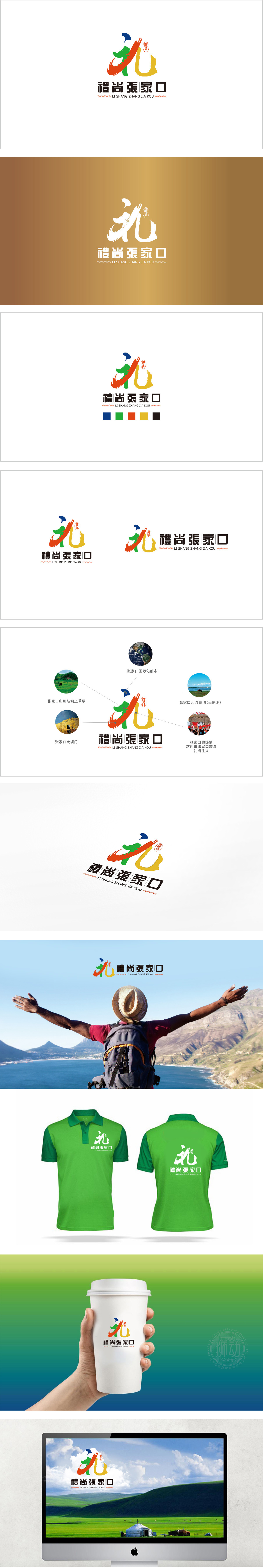
狮动设计采用自然感传递旅游的“代入感”,标志采用蓝、绿、红、黄四大高饱和度色系,完美对应了张家口的核心旅游资源,蓝色:象征蓝天碧水,传递“生态宜居”的旅游印象;绿色:代表张北草原的葱郁、崇礼森林的生机,契合“户外休闲”的旅游属性;红色:似康巴诺尔湖的晚霞、蔚县剪纸的红火,暗含“热情好客”的文化温度;黄色:像怀来葡萄的金黄、鸡鸣驿古城的暖阳,隐喻“丰收与历史”的双重体验。用抽象化的“礼”字与流动的飘带/火焰元素的融合:整体将张家口的“自然资源”“文化底蕴”“情感诉求”浓缩成可感知的视觉符号——用颜色链接自然,用图形传递情感,用文化强化记忆。
Lion Design conveys the sense of substitution of tourism with a sense of nature, and the logo adopts four high saturation color systems of blue, green, red and yellow, which perfectly corresponds to the core tourism resources of Zhangjiakou. Blue symbolizes blue sky and clear water and conveys the tourism impression of "ecological livability"; Green: it represents the lush grassland in Zhangbei and the vitality of Chongli forest, which is in line with the tourism attribute of "outdoor leisure"; Red: like the sunset glow of Lake Kangbanor and the flourishing paper-cutting in Yuxian.


扫码或拨打添加客服微信


