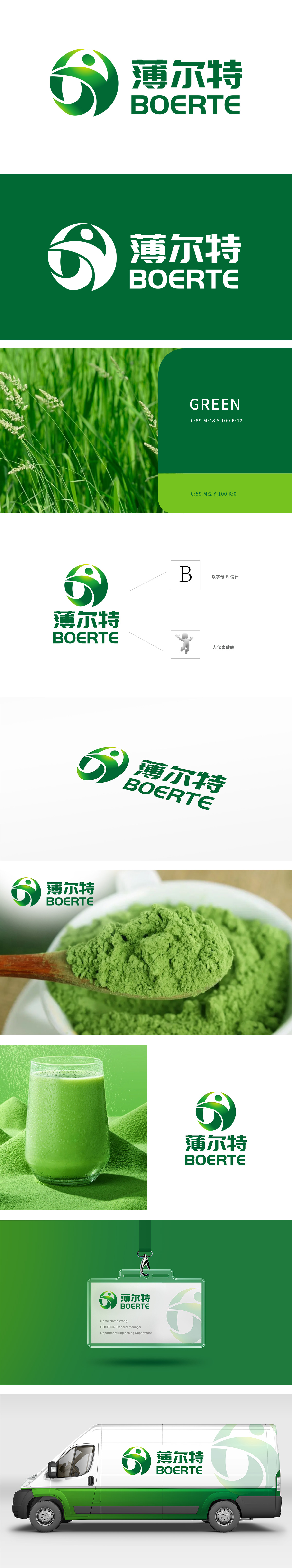
狮动设计以品牌首字母“B”为创意起点,通过流线型曲线勾勒出环抱式轮廓:既强化品牌名”的记忆点,又通过流畅笔触传递食品的天然、柔和属性,整体圆形轮廓隐喻“圆满、安全”,绿色渐变象征食材的新鲜、天然与有机,贴合食品行业对“健康、纯净”的核心诉求,色系采用绿色,让消费者在快速识别品牌名称的同时,通过视觉联想建立“健康、可靠、愉悦”的品牌认知,为食品产品的市场竞争力奠定视觉基础。
Lion design takes the brand initials "B" as the creative starting point, and outlines an encircling outline through streamlined curves: it not only strengthens the memory point of brand name, but also conveys the natural and soft attributes of food through smooth strokes. The overall circular outline symbolizes "perfection and safety", and the gradual change of green symbolizes the freshness, nature and organic of ingredients, which fits the core appeal of food industry for "health and purity".


扫码或拨打添加客服微信


