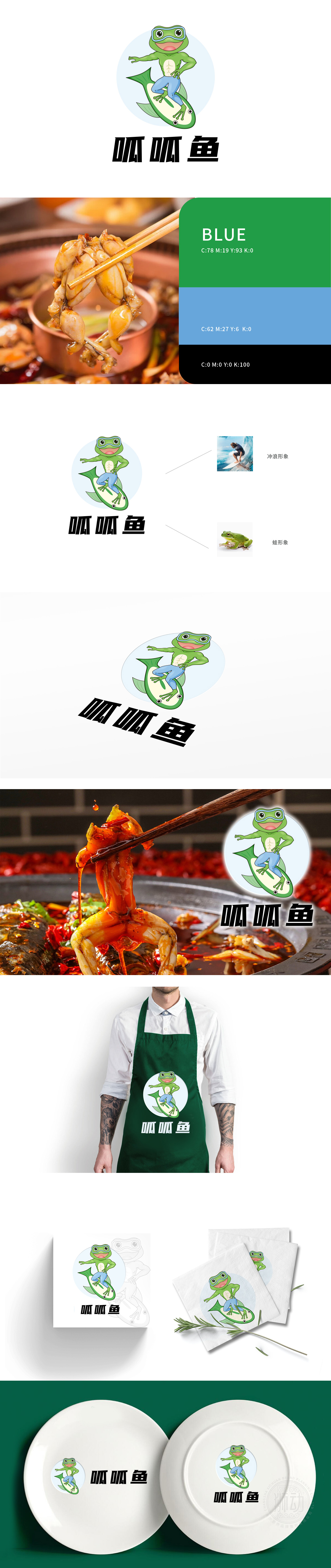
狮动设计基于绿色青蛙为核心IP,采用拟人化设计(戴潜水镜、咧嘴笑、直立姿态),既保留了青蛙的生物特征,又通过动态肢体语言传递出活泼、亲切的品牌性格,符合餐饮行业“拉近消费者距离”的情感需求。青蛙脚下的“冲浪板”巧妙设计为鱼的造型,既呼应品牌名称“呱呱鱼”中的“鱼”字,,又通过鱼身的弧线与青蛙的动态形成视觉平衡,强化“水生”主题。冲浪象征“活力、自由、潮流”,精准触达年轻消费群体,通过“青蛙冲浪”的拟人化场景,品牌不仅是“提供美食”的载体,更成为“传递快乐、趣味生活方式”的符号。
Lion Movement team conducted in-depth research on the industry trends.Lion design takes green frog as the core IP and adopts anthropomorphic design (wearing diving goggles, grinning and standing posture), which not only retains the biological characteristics of frog, but also conveys a lively and friendly brand character through dynamic body language, which meets the emotional needs of catering industry to "bring consumers closer". The "surfboard" under the frog's feet is cleverly designed in the shape of a fish, which not only echoes the word "fish" in the brand name "quack fish", but also forms a visual balance with the frog's dynamics through the arc of the fish body.


扫码或拨打添加客服微信


