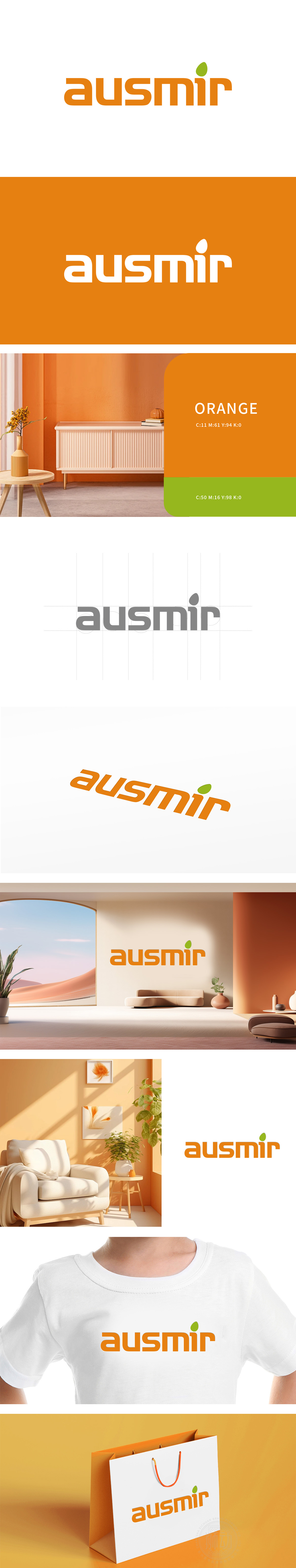
狮动设计将整体采用圆润无衬线字体,笔画边缘平滑无尖锐棱角(如“a”的圆弧开口、“u”的流畅曲线、“m”的对称弧形),弱化了机械感,传递出家居装饰行业所需的舒适、柔和、贴近生活的气质,符合用户对“家”的温暖联想。右上角的绿色叶片图形作为点睛元素,采用抽象化处理,边缘圆润、弧度自然,与字体的柔和风格统一,同时叶片向上的生长态势,暗含“生机、焕新”的寓意,呼应家居装饰为空间“注入活力与美感”的核心功能。整体通过“品牌名+行业符号”的高效识别结构,既保持了现代设计的简约性,又通过细节传递出家居装饰行业的核心价值——用设计赋予空间温度,用自然元素连接生活。
Lion design will adopt rounded sans-serif fonts as a whole, and the edges of strokes are smooth without sharp edges (such as the arc opening of "A", the smooth curve of "U" and the symmetrical arc of "M"), which weakens the mechanical sense, conveys the comfortable, soft and close-to-life temperament required by the home decoration industry, and conforms to the warm association of users with "home". As the finishing touch, the green leaf figure in the upper right corner is abstracted, with rounded edges and natural radian, which is consistent with the soft style of the font. At the same time, the upward growth trend of the leaf implies the meaning of "vitality and rejuvenation".


扫码或拨打添加客服微信


