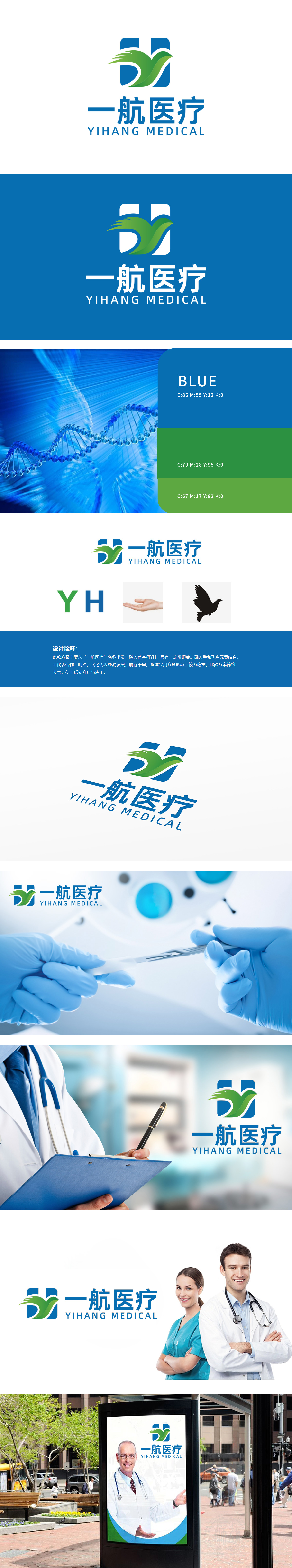
狮动设计以“一航医疗”首字母“Y”“H”为骨架:蓝色“H”作为基底,呈方形结构,象征医疗行业的专业、稳定与严谨;绿色“Y”以流线型笔触融入,打破静态感,传递生机与创新,也暗示医疗技术的动态发展。字母融合自然,形成“方中带圆”的视觉平衡,,体现“科技服务于人”的温度。与医疗行业“守护生命”的使命高度契合;同时“飞鸟”的动态感隐喻“高效、突破、远大前景”,暗示医疗机械技术的创新力与行业发展潜力,此方案通过“字母具象化+情感符号植入”,精准平衡了医疗机械行业的“专业性”与“人文性”。
Lion design is based on the initials "Y" and "H" of "Yihang Medical": the blue "H" is a square structure, which symbolizes the professionalism, stability and rigor of the medical industry; Green "Y" is integrated with streamlined strokes, which breaks the sense of static, conveys vitality and innovation, and also implies the dynamic development of medical technology. Letters blend naturally, forming a visual balance of "circle in the square" and reflecting the temperature of "science and technology serving people",It is highly compatible with the mission of "protecting life" in the medical industry.


扫码或拨打添加客服微信


