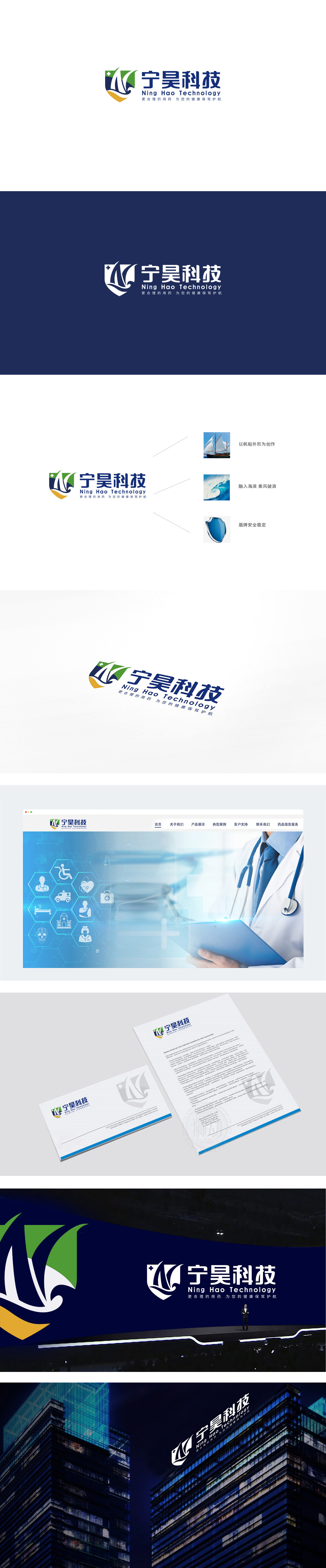
狮动设计采用盾牌造型是整个 logo 的灵魂,直接对应 slogan 中的“保驾护航”,强调整个品牌的“保护者”角色,绿色叶片:用自然元素关联“生命、健康”,呼应“合理用药”的底层逻辑;蓝白波浪/字母“N”变形:蓝色部分既是“宁”的首字母抽象,又像流动的“药”或“生命能量”,既保留了科技公司的“现代感”,又暗示了“用药”的行业属性;黄色基底:盾牌底部的黄色块像“支撑”或“大地”,增加了视觉的稳重感,同时用温暖色调中和了科技感的冷硬,让品牌更有“亲和力”。把品牌理念(健康守护)、行业属性(用药/科技)、用户情绪(可靠/温暖)用最简洁的视觉语言表达了出来。
Lion design adopts the shield shape as the soul of the whole logo, which directly corresponds to the "escort" in slogan and emphasizes the role of "protector" of the whole brand. Green leaves: use natural elements to associate "life and health" and echo the underlying logic of "rational drug use"; Blue and white waves/letter "n" deformation: the blue part is not only the abstraction of the first letter of "Ning", but also like flowing "medicine" or "life energy", which not only retains the "modernity" of technology companies, but also implies the industrial attribute of "medication".


扫码或拨打添加客服微信


