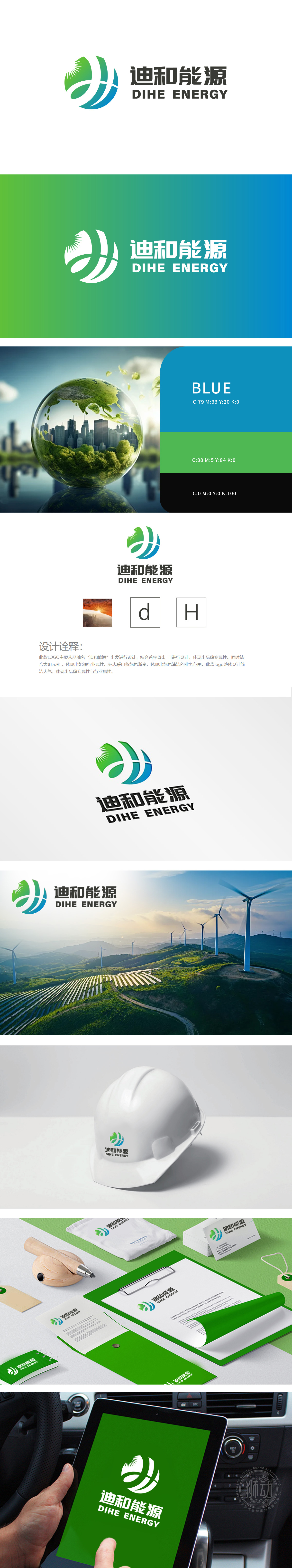
狮动设计以品牌名“迪和能源”首字母 “D”“H” 为核心创意点,通过流畅的线条将字母解构重组,形成环绕式图形主体,太阳元素:图形顶部的放射状光芒(绿色渐变+白色高光)直接关联“能源”核心,象征太阳能、清洁能源属性,蓝绿色环形线条呈螺旋上升趋势,既象征能源的循环利用,也寓意企业的持续发展与活力,通过“太阳+循环线条”的组合,传递“绿色、高效、可持续”的品牌理念,契合当前全球能源转型趋势,体现设计对品牌战略的深度支撑。
LionDesign takes the initial letter "D" and "H" of the brand name "Dihe Energy" as the core creative point, and deconstructs and reorganizes the letters through smooth lines, forming a circular graphic subject. The sun element: the radial light (green gradient+white highlight) at the top of the graphic is directly related to the "energy" core, symbolizing the attributes of solar energy and clean energy, and the blue-green circular lines show a spiral upward trend, which not only symbolizes the recycling of energy, but also symbolizes enterprises.


扫码或拨打添加客服微信


