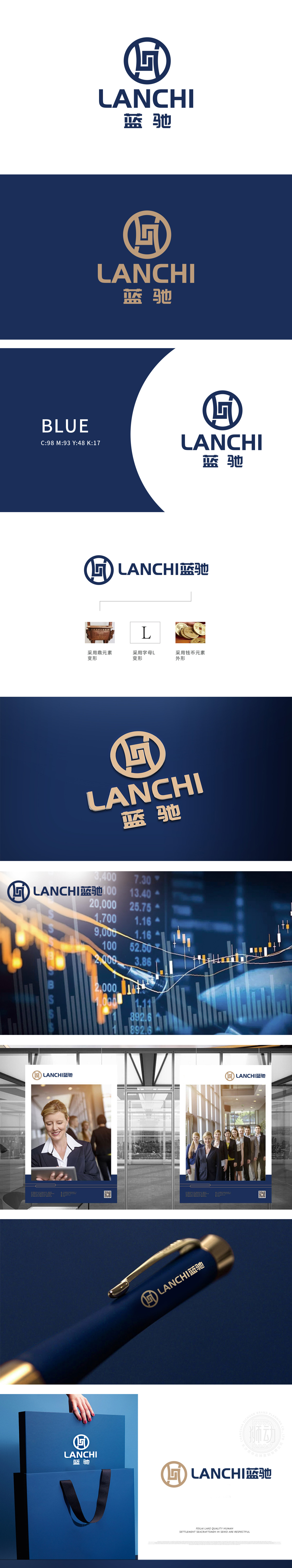
狮动设计通过线条穿插形成字母“L”,“L”的竖线挺拔如“支柱”,象征企业在行业中的稳定地位;横线的延伸感则暗喻“业务拓展”“资本流动”,体现金融服务的“连接性”与“成长性”。以青铜器“鼎”的轮廓为基础,通过对称结构与几何化线条抽象变形,保留鼎的稳重形态,同时融入环形包围结构,增强封闭感与安全感。鼎在传统文化中代表“权力、信誉与财富积淀”,呼应金融财务领域对“稳健经营、风险防控”的核心诉求;环形包围结构则隐喻资金闭环、资产保护,传递“值得信赖”的品牌形象,实现用视觉符号讲透金融逻辑,让品牌形象自带“行业说服力”。
Lion design forms the letter "L" by inserting lines, and the vertical line of "L" is as tall and straight as "pillar", which symbolizes the stable position of enterprises in the industry; The extension of the horizontal line is a metaphor for "business expansion" and "capital flow", which embodies the "connectivity" and "growth" of financial services. Based on the outline of the bronze "Ding", the symmetrical structure and geometric lines are abstracted and deformed, and the stable shape of the Ding is preserved, and at the same time, it is integrated into the annular surrounding structure to enhance the sense of closure and security.


扫码或拨打添加客服微信


