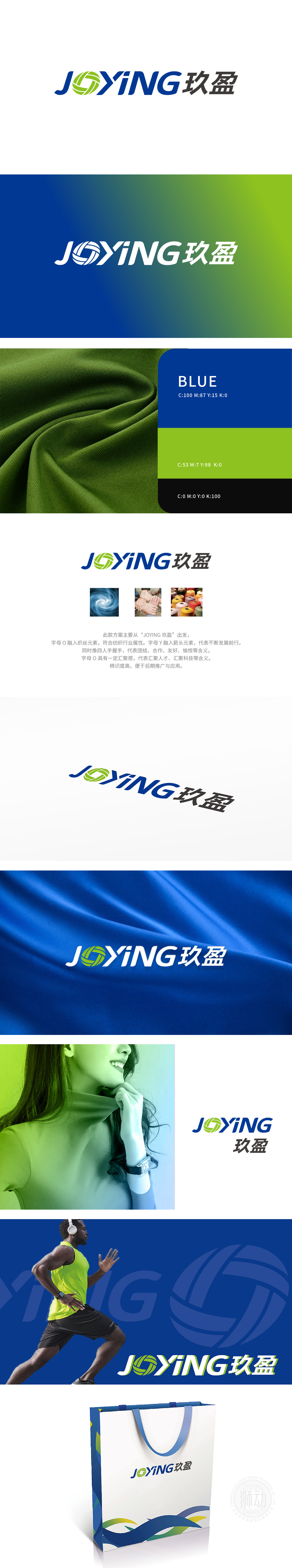
狮动设计将字母“O”以绿色螺旋线条构成,形似纺织过程中的丝线缠绕、织机运转轨迹,直接呼应纺织品的“丝、线、织”核心属性,视觉上直观传递行业身份,增强品牌与纺织领域的关联性。螺旋结构的“O”呈现向内汇聚的动态感,既象征纺织原料的汇集,也隐喻品牌对行业资源、技术、人才的整合能力,契合纺织品企业“从原料到成品”的全链条发展逻辑。通过行业属性、发展愿景、合作精神 三大核心维度,构建了“JOYING 玖盈”的品牌视觉体系。图形符号既精准锚定纺织品行业特性,又赋予品牌“汇聚资源、创新前行”的深层内涵。
Lion design letter "O" is composed of green spiral lines, which is similar to the winding of silk thread and the running track of loom in the textile process, directly echoing the core attributes of "silk, thread and weaving" of textiles, visually conveying the industry identity and enhancing the relevance between brands and the textile field. The "O" of spiral structure presents a dynamic sense of inward convergence, which not only symbolizes the collection of textile raw materials, but also symbolizes the brand's ability to integrate industry resources, technology and talents, which is in line with the whole chain development logic of textile enterprises from raw materials to finished products.


扫码或拨打添加客服微信


