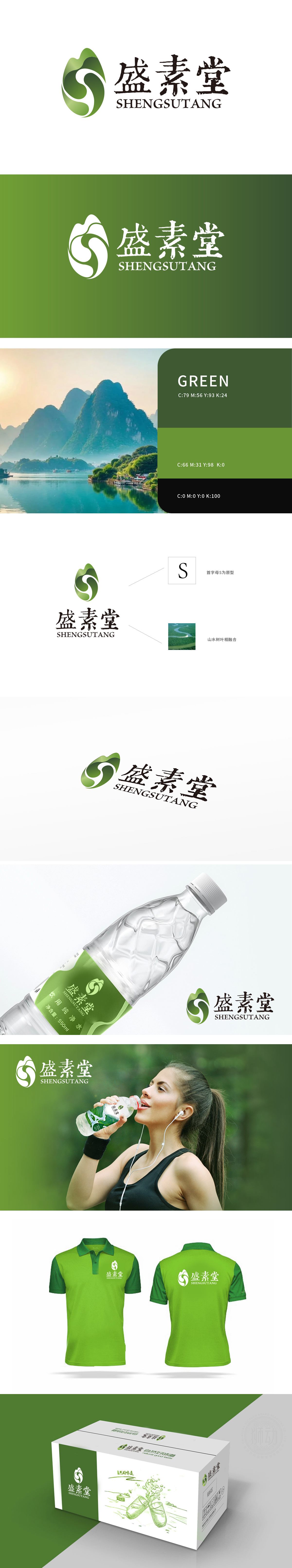
狮动设计采用品牌名称“盛素堂”首字母 “S” 为原型,整体轮廓近似一片舒展的绿叶,象征自然、纯净,贴合矿泉水“天然萃取”的产品定位;通过流畅的曲线勾勒出主体轮廓,既是品牌识别的视觉锚点,又巧妙呼应了矿泉水的核心联想——水的流动性。绿色渐变的色彩运用(从深绿到浅绿)不仅传递出天然、健康的品牌调性,更暗合矿泉水“源自自然”的品类属性,整体设计通过 “字母原型+自然意象+品类联想” 的三重设计逻辑,既确保了品牌标识的独特性(首字母S的专属化演绎),又精准呼应了矿泉水“天然、纯净、源自山水”的品类特性。
Lion design is based on the initial letter "S" of the brand name "Shengsutang", and the overall outline is similar to a stretch of green leaves, which symbolizes nature and purity and fits the product positioning of "natural extraction" of mineral water. Drawing the outline of the main body through a smooth curve is not only the visual anchor point of brand recognition, but also cleverly echoes the core association of mineral water-the fluidity of water. The gradual application of green color (from dark green to light green) not only conveys the natural and healthy brand tonality, but also coincides with the category attribute of mineral water. Through the triple design logic of "letter prototype+natural image+category association".


扫码或拨打添加客服微信


