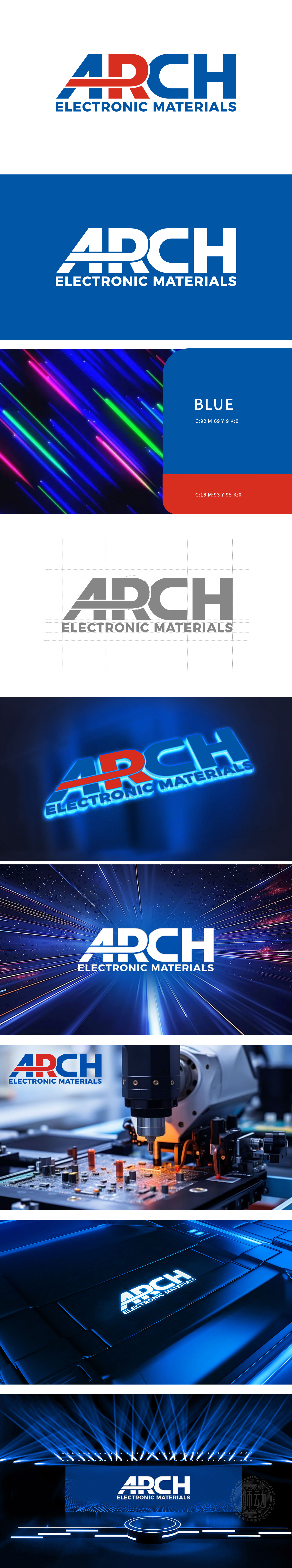
狮动设计采用英文“ARCH”,字母设计融合力量感与科技属性:A/C/H 以蓝色粗体呈现,线条硬朗垂直,象征行业的“稳定性”与“精密性”;R 以红色突出,倾斜角度与右侧蓝色“CH”形成视觉衔接,红色的活力打破蓝色的沉稳,隐喻品牌“创新突破”。通过“以小见大”的图形语言,成功将“ARCH”塑造为兼具“技术实力”与“创新基因”的品牌形象。
Lion design adopts English "ARCH", and the letter design combines strength and scientific and technological attributes;A/C/H is presented in blue bold, and the lines are tough and vertical, symbolizing the "stability" and "precision" of the industry; R is highlighted in red, and the angle of inclination forms a visual connection with the blue "CH" on the right. The vitality of red breaks the calmness of blue, which symbolizes the brand's "innovation breakthrough".
\


扫码或拨打添加客服微信


