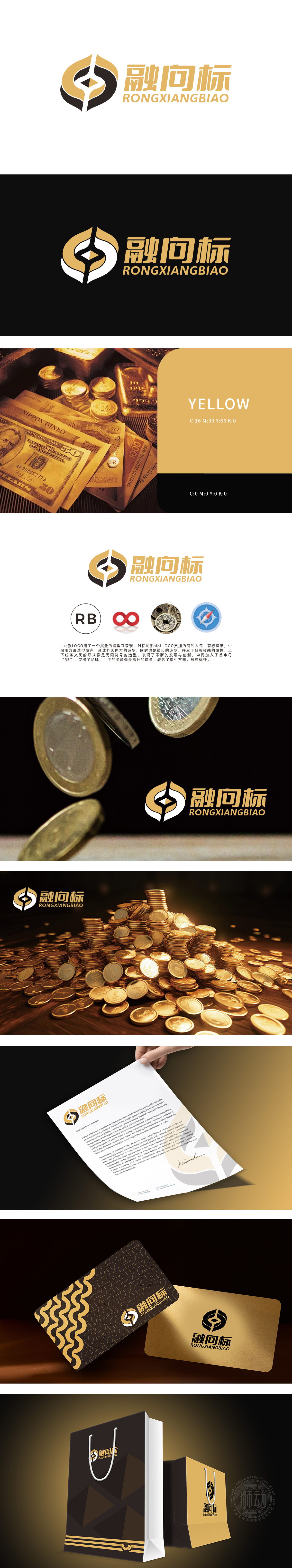
狮动设计以对称叠层结构形成“外圆内方”造型,直接呼应中国传统钱币“天圆地方”的经典形态(如古铜钱“通宝”造型),明确传递金融行业的货币属性与财富管理定位,强化品牌在金融领域的专业辨识度。“RB”首字母与无限符号的商业,隐喻金融业务的可持续增长、资源循环利用,契合金融领域对“长期价值”与“创新发展”的追求。指南针指针形态既象征为用户提供投资方向、财务规划的精准指导,也暗喻品牌致力于成为行业标杆的愿景,与金融服务中“降低信息差、提升决策效率”的核心价值高度匹配,实现了“图形美学”与“商业功能”的深度统一,充分展现了对金融领域用户心理与行业特性的精准把握。
Lion Design forms the shape of "outer circle and inner side" with symmetrical laminated structure, which directly echoes the classic shape of China traditional coin "the place where the sky is round" (such as the "Tongbao" shape of ancient copper coins), clearly conveys the monetary attribute and wealth management orientation of the financial industry, and strengthens the professional recognition of the brand in the financial field. The business with the initials of "RB" and unlimited symbols symbolizes the sustainable growth of financial business and the recycling of resources, which is in line with the pursuit of "long-term value" and "innovative development" in the financial field. The compass pointer shape not only symbolizes providing users with accurate guidance .


扫码或拨打添加客服微信


