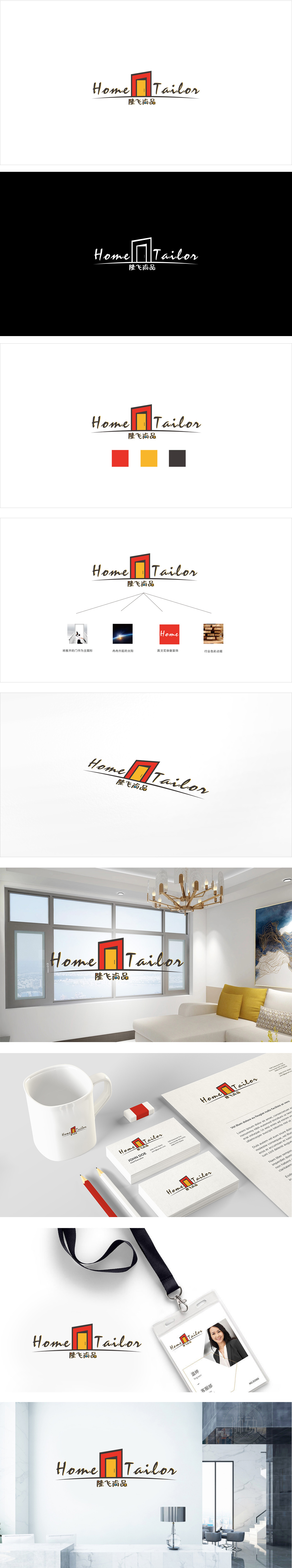
狮动设计以“门”为视觉核心,既对应“Home”(家)的物理载体,又隐含“进入定制化家居生活”的隐喻;手写体字体,则通过笔触的温度感,强化了“一对一、有温度的定制服务”属性。这种“门+定制”的组合,用最简洁的符号传递了最明确的品牌信息,用户看到的瞬间就能联想到“家居定制”的业务场景,符合“图形即语言”的设计逻辑。红色边框(热情、活力)与黄色门板(温馨、温暖)的组合,完美匹配“家居”场景的情绪诉求——红色像家的“烟火气”,黄色像灯光的“归属感”,隆飞尚品”的中文采用黑底+烫金(或金色)的设计,则平衡了“温馨”与“品质”,传递出“定制不只是个性化,更是对生活品质的追求”的品牌调性。
Lion design takes "door" as the visual core, which not only corresponds to the physical carrier of "Home", but also implies the metaphor of "entering customized home life"; Handwritten fonts strengthen the attribute of "one-to-one, customized service with temperature" through the sense of temperature of strokes. This combination of "door+customization" conveys the clearest brand information with the simplest symbols, and users can instantly associate it with the business scene of "home customization". which conforms to the design logic of "graphics is language".
The combination of red frame (enthusiasm and vitality) and yellow door panel (warmth and warmth) perfectly matches the emotional appeal of "home" scene-red is like the "fireworks" of home.


扫码或拨打添加客服微信


