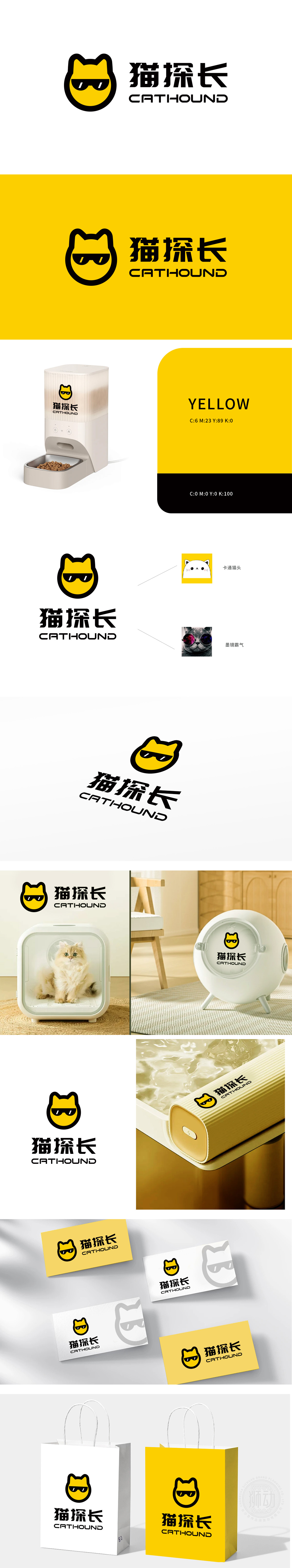
狮动设计以极简几何线条勾勒猫咪头部轮廓,黄色主色调传递温暖、活力(符合宠物食品传递的“天然、健康”联想),标志性墨镜元素打破传统宠物LOGO的“萌系单一性”,赋予猫咪“探长”般的机敏、可靠气质,暗喻品牌对宠物食品品质的“严格把关”与“专业探索”,猫元素的双重性格融合,精准锚定宠物食品情感价值,墨镜猫咪头宠物食品的“专业感”与“陪伴感”平衡,从“卡通萌感”到“霸气态度”,覆盖多元消费心理,从“视觉符号”到“品牌资产”的链路闭环。
Lion design outlines the cat's head with minimalist geometric lines, the yellow main color conveys warmth and vitality (in line with the "natural and healthy" association of pet food delivery), and the iconic sunglasses element breaks the "budding oneness" of the traditional pet LOGO, giving the cat a smart and reliable temperament like a detective, implying that the brand is "strictly controlling" and "professionally exploring" the quality of pet food, and the dual personality of the cat element is integrated and accurate.


扫码或拨打添加客服微信


