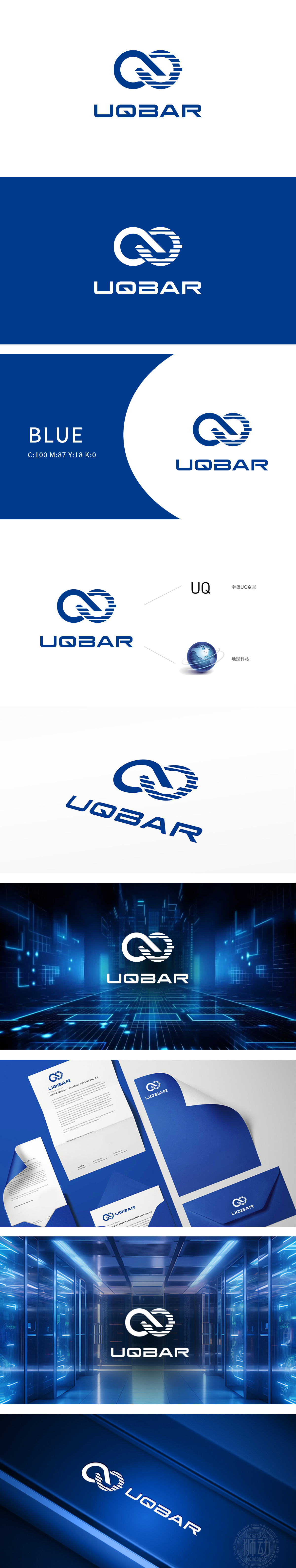
狮动设计以“U”和“Q”为基础进行变形设计:左侧的“U”,右侧以圆环结构收尾,中间通过斜线连接形成闭环,整体构成无限符号(∞)的变体。既保留了品牌名称的核心字母识别性,又通过循环结构传递出“无限连接、持续拓展”的互联网特性,暗合数据、信息的流动与交互逻辑。图形内部嵌入横向蓝白相间的线条纹理,增强了科技行业的属性联想;UQB BAR构建了互联网科技的视觉图腾。这个由蓝白数据流编织的无限环,既是UQ字母的基因重组,更是互联网「无边界交互、永动式创新」的视觉宣言,让新客户一眼洞见:这,就是科技品牌该有的冲击力!
Lion design is based on "U" and "Q" for deformation design: the "U" on the left side ends with a ring structure on the right side, and the middle is connected by diagonal lines to form a closed loop, which constitutes a variant of infinite symbol (∞) as a whole. It not only retains the recognition of the core letters of the brand name, but also conveys the internet characteristics of "infinite connection and continuous expansion" through the circular structure, which coincides with the flow and interactive logic of data and information. The horizontal blue and white line texture is embedded in the graphics.


扫码或拨打添加客服微信


