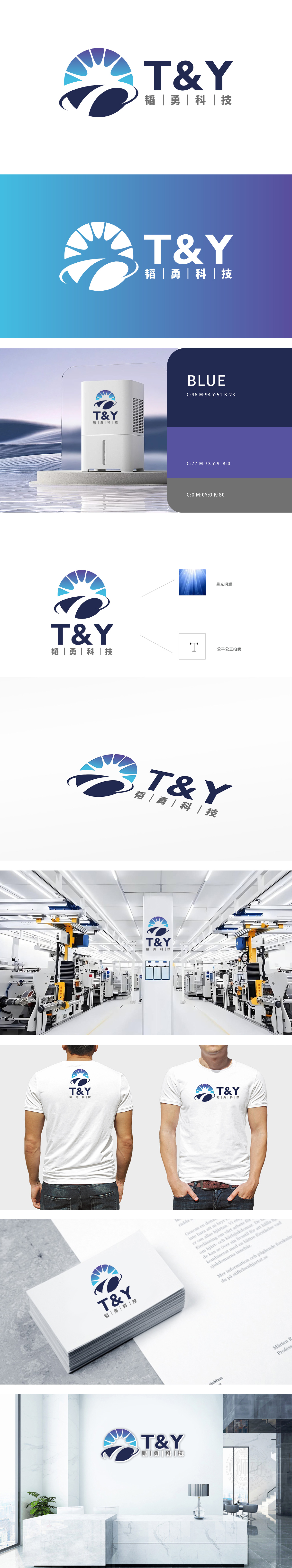
狮动设计以字母“T”作为品牌名“T&Y”的首字母,被单独提取并赋予“公平公正”的内涵,通过“T”的对称结构,强化品牌在“科技”领域的核心价值主张,实现“符号-业务-价值”的三重对应,以渐变蓝紫色调构建的放射状轮廓,既呼应了“科技”行业的未来感,又通过光芒扩散的动态线条传递“创新突破”的品牌精神,深蓝色环形包裹抽象曲线,形似轨迹环绕或数据流动,既象征科技行业的“连接性”,又通过流畅的曲线打破放射图形的静态感,传递“动态创新”的品牌气质。
Lion design takes the letter "T" as the initial letter of the brand name "T&Y", which is extracted separately and endowed with the connotation of "fairness and justice". It may strengthen the brand's core value proposition in the field of "science and technology" through the symmetrical structure of "T" and realize the triple correspondence of "symbol-business-value". The radial outline constructed with gradual blue-purple tones not only echoes "science and technology" The dark blue ring wraps the abstract curve, which looks like a trajectory or data flow. It not only symbolizes the "connectivity" of the technology industry, but also breaks the static sense of radiation graphics through smooth curves and conveys the brand temperament of "dynamic innovation".


扫码或拨打添加客服微信


