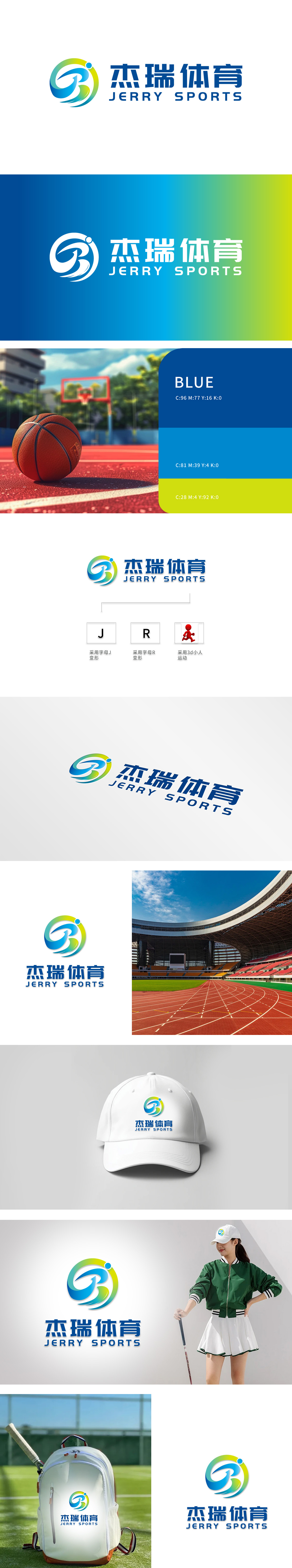
狮动设计以品牌名称首字母 “J” 和 “R”变形,通过流畅的曲线变形与色彩渐变,构建出极具动感的视觉符号:字母“J”的艺术化表达:以舒展的弧线呈现,象征运动的延展性与包容性,字母“R”的动态融合:暗喻运动中的能量传递与活力迸发。整体造型呈现旋转上升”的动态轨迹,形似运动员腾空、冲刺或投掷的瞬间姿态,传递“突破、进取、永不停歇”的体育精神,整体设计 形成“具象+抽象”的双重呼应直观传递体育品牌的“动感、积极、专业”的核心信息。
Lion Design uses the brand name initials "J" and "R" to deform, and through smooth curve deformation and color gradient, it constructs a very dynamic visual symbol: the artistic expression of the letter "J": presented in a stretched arc, symbolizing the extensibility and inclusiveness of the movement, and the dynamic fusion of the letter "R": a metaphor for the energy transfer and vitality of generate in the movement. The overall shape presents a dynamic trajectory of "rotating and rising", which is similar to the instantaneous posture of athletes flying, sprinting or throwing, conveying the sports spirit of "breakthrough.


扫码或拨打添加客服微信


