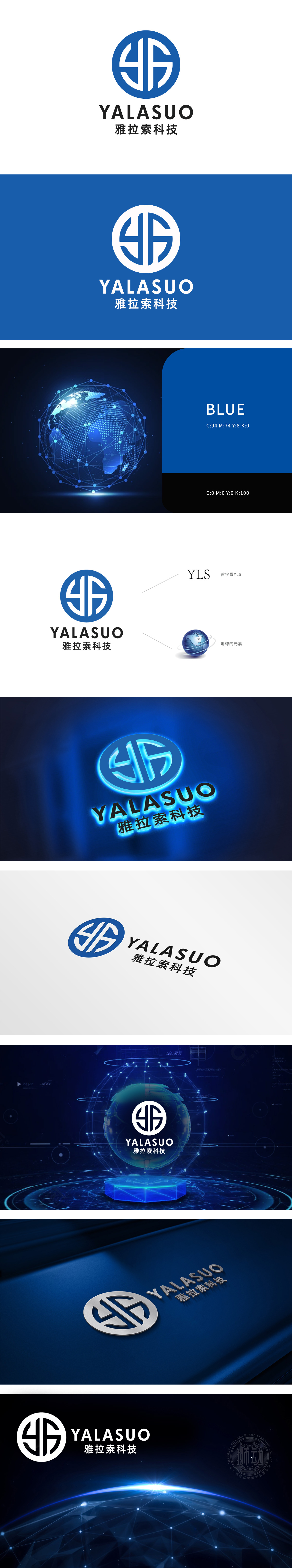
狮动设计以品牌名称“雅拉索”首字母 Y、L、S 为设计原点,通过极简的几何线条将三字母抽象解构并重构为环形内的对称符号。字母间的穿插与咬合,形成动态平衡,既保留字母识别性,又传递出科技企业的精密协作与互联属性。外部蓝色正圆不仅强化了图形的稳定性与完整性,更暗合“科技闭环”“全球化”“无限可能”的概念,整体通过首字母抽象化、科技色彩应用、全球化符号植入三大策略,传递出以“简洁、流动、互联”为核心,暗合互联网科技行业的“高效、连接、创新”特质。
Lion design takes the initial letters Y, L and S of the brand name "Yalaso" as the design origin, and deconstructs the three letters abstractly and reconstructs them into symmetrical symbols in the ring through minimalist geometric lines. The interpenetration and occlusion between letters form a dynamic balance, which not only retains the recognition of letters, but also conveys the precise cooperation and interconnection properties of technology enterprises. The external blue perfect circle not only strengthens the stability and integrity of graphics
.


扫码或拨打添加客服微信


