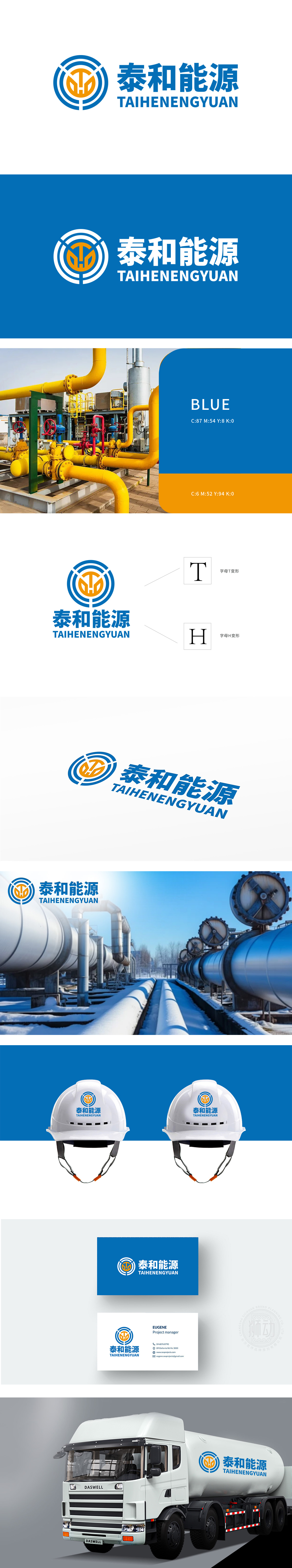
狮动设计以中心“T+H”字母变形:内部橙色图形由“T”(泰,Tai)和“H”(和,He)抽象融合而成,两字母交叉处形成类似管道“阀门”或“节点”的结构,既呼应企业名称“泰和”,又暗喻管道运输中的关键控制与高效流通,强化行业专属属性。外层蓝色环形线条模拟石油管道的“环形运输网络”,体现管道运输的闭环性、连续性和覆盖性,象征企业业务的稳定性与全球化布局潜力。。该LOGO通过“管道环形+T/H字母融合”的核心设计,精准捕捉石油管道运输行业的“网络性、安全性、高效性”,蓝色与橙色的经典配色强化能源属性,整体图形简洁有力,也为泰和能源树立了“专业、可靠、创新”的品牌形象。
Lion design is based on the letter "T+H" in the center: the orange figure inside is abstractly fused with "T" (Tai) and "H" (He, He), and the intersection of the two letters forms a structure similar to pipeline "valve" or "node", which not only echoes the enterprise name "Taihe", but also implies the key control and efficient circulation in pipeline transportation, strengthening the exclusive attributes of the industry. The outer blue circular line simulates the "circular transportation network" of oil pipelines, which embodies the closed loop, continuity and coverage of pipeline transportation and symbolizes the stability and global layout potential of enterprise business.


扫码或拨打添加客服微信


