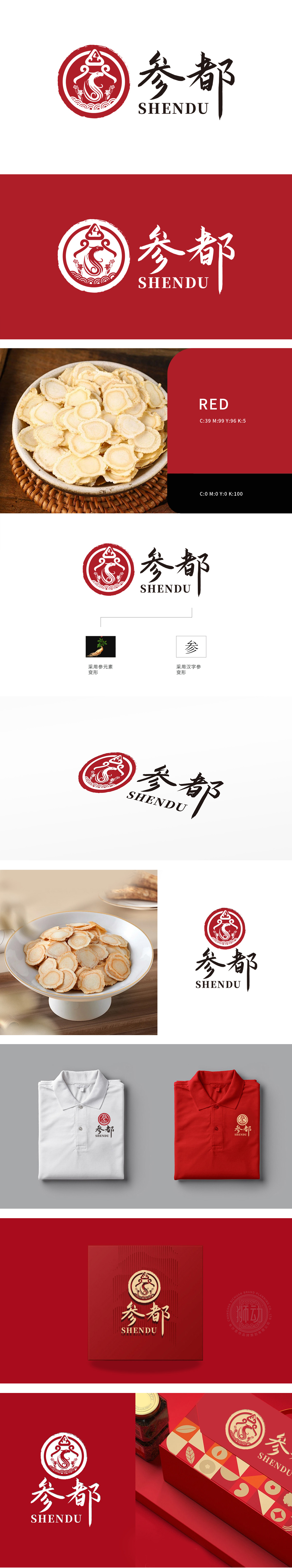
狮动设计提取以人参形态为原型,通过艺术化变形呈现提升品牌调性,适配高端食品,图形边缘点缀祥云纹、花朵元素,祥云象征吉祥与传统滋补文化,花朵呼应人参的“天然草本”属性,进一步锚定“健康、滋补、原生态”的食品品类认知,尤其贴合人参类保健食品、滋补食材的定位。整体通过人参元素的艺术化变形、传统符号的现代转译、行业色彩的精准应用,成功构建了“滋补食品”的品牌视觉体系。其设计既彰显了东方文化底蕴,又清晰传递了“人参核心原料”的品类信息,适配高端滋补食品、保健品等细分领域。
Lion Design takes ginseng form as the prototype, enhances brand tonality through artistic transformation, and adapts to high-end food. The edge of the graphic is dotted with auspicious clouds and flower elements, with auspicious clouds symbolizing auspicious and traditional nourishing culture, and flowers echoing the "natural herb" attribute of ginseng, further anchoring the food category cognition of "health, nourishing and original ecology", especially fitting the positioning of ginseng health food and nourishing ingredients. Through artistic transformation of ginseng elements, modern translation of traditional symbols and accurate application of industrial colors, the brand visual system of "nourishing food" has been successfully constructed.


扫码或拨打添加客服微信


