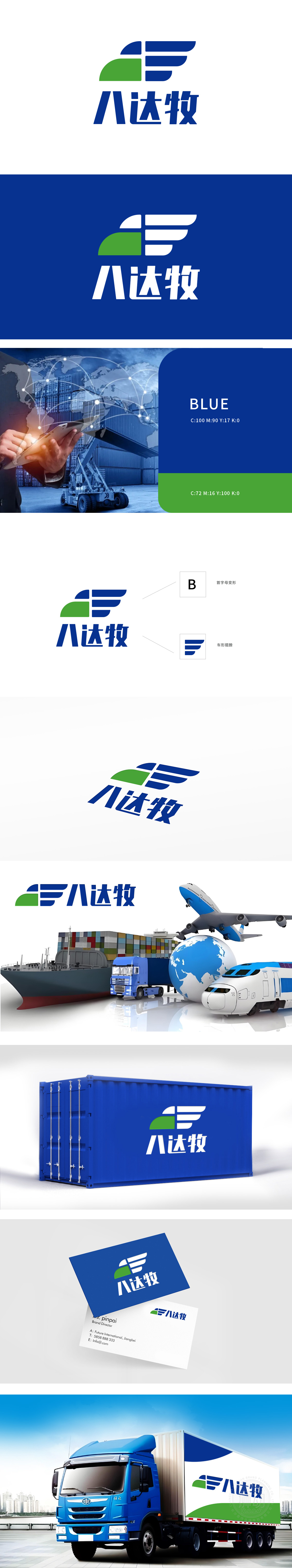
狮动设计以企业名称“八达牧”拼音首字母 “B” 为原型,通过几何化切割重组:上部蓝绿色块构成“B”的左侧竖线,右侧三条平行蓝色线条形成“B”的右侧曲线,整体呈现硬朗的字母结构,同时暗藏物流行业的“运输工具”意象——三条蓝色横线模拟货车的“车厢”或“车轨”,线条平行排列强化“高效、有序”的物流运输感。搭配斜向倾斜的动态角度,传递“高速运输”的行业属性;同时,三条线条向上扬起的形态融入“翅膀”意象,象征物流服务的“覆盖广泛”(呼应“八达”)与“突破限制”的延展性,强化“通达八方”的品牌联想。整体通过“首字母变形(B)+ 车形符号+翅膀意象” 的三重融合,既以抽象图形传递了“八达牧”的品牌名称,又通过色彩、线条和造型细节,精准锚定物流行业“高效运输、广泛覆盖、专业可靠”的核心价值。
Lion Design is based on the initial letter "B" of the company name "Badamu", and is reorganized by geometric cutting: the upper blue-green block forms the left vertical line of "B", and the three parallel blue lines on the right form the right curve of "B", which presents a tough letter structure as a whole, while hiding the image of "transportation tool" in the logistics industry-three blue horizontal lines simulate the "carriage" or "track" of a truck. With the oblique dynamic angle, it conveys the industry attribute of "high-speed transportation"; At the same time, the pattern of three lines rising upwards is integrated into the image of "wings".which symbolizes the extensive coverage of logistics services (echoing "extending to all directions") and the extensibility of "breaking through restrictions" and strengthens the brand association of "reaching all directions".


扫码或拨打添加客服微信


